(Note: The apparent typo in the title is deliberate.)
In my experience with introductory statistics classes, both ones I’ve taken and ones I’ve heard about, they typically have two primary phases. The second involves hypothesis testing and regression, which entail trying to evaluate the statistical evidence regarding well-formulated questions. (Well, in an ideal world the questions are well-formulated. Not always the case, as I bitched about on Twitter recently.) This is the more challenging, mathematically sophisticated part of the course, and for those reasons it’s probably the one that people don’t remember quite so well.
What’s the first part? It tends to involve lots of summary statistics and plotting—means, scatterplots, interquartile ranges, all of that good stuff that one does to try to get a handle on what’s going on in the data. Ideally, some intuition regarding stats and data is getting taught here, but that (at least in my experience) is pretty hard to teach in a class. Because this part is more introductory and less complicated, I think this portion of statistics—which is called exploratory data analysis, though there are some aspects of the definition I’m glossing over—can get short shrift when people discuss cool stuff one can do with statistics (though data visualization is an important counterpoint here).
A slightly more complex technique one can do as part of exploratory data analysis is principal component analysis (PCA), which is a way of redefining a data set’s variables based on the correlations present therein. While a technical explanation can be found elsewhere, the basic gist is that PCA allows us to combine variables that are related within the data so that we can pack as much explanatory power as possible into them.
One classic application of this is to athletes’ scores in the decathlon in the Olympics (see example here). There are 10 events, which can be clustered into groups of similar events like the 100 meters and 400 meters and the shot put and discus. If we want to describe the two most important factors contributing to an athlete’s success, we might subjectively guess something like “running ability” and “throwing skill.” PCA can use the data to give us numerical definitions of the two most important factors determining the variation in the data, and we can explore interpretations of those factors in terms of our intuition about the event.
So, what if we take this idea and apply it to baseball hitting data? This would us allow to derive some new factors that explain a lot of the variation in hitting, and by using those factors judiciously we can use this as a way to compare different batters. This idea is not terribly novel—here are examples of some previous work—but I haven’t seen anyone taking the approach I have now. For this post, I’m focused more on what I will call hitting style, i.e. I’d like to divorce similarity based on more traditional results (e.g. home runs—this is the sort of similarity Baseball-Reference uses) in favor of lower order data, namely a batter’s batted ball profile (e.g. line drive percentage and home run to fly ball ratio). However, the next step is certainly to see how these components correlate with traditional measures of power, for instance Isolated Slugging (ISO).
So, I pulled career-level data from FanGraphs for all batters with at least 1000 PA since 2002 (when batted ball data began being collected) on the following categories: line drive rate (LD%), ground ball rate (GB%), outfield fly ball rate (FB%), infield fly ball rate (IFFB%), home run/fly ball ratio (HR/FB), walk rate (BB%), and strike rate (K%). (See report here.) (I considered using infield hit rate as well, but it doesn’t fit in with the rest of these things—it’s more about speed and less about hitting, after all.)
I then ran the PCA on these data in R, and here are the first two components, i.e. the two weightings that together explain as much of the data as possible. (Things get a bit harder to interpret when you add a third dimension.) All data are normalized, so that coefficients are comparable, and it’s most helpful to focus on the signs and relative magnitudes—if one variable is weighted 0.6 and the other -0.3, the takeaway is that the first is twice as important for the component as the second and pushes that component in the opposite direction.
| PC1 | PC2 | |
|---|---|---|
| LD% | -0.030 | 0.676 |
| GB% | -0.459 | 0.084 |
| FB% | 0.526 | 0.093 |
| IFFB% | -0.067 | -0.671 |
| HR/FB | 0.459 | -0.137 |
| BB% | 0.375 | 0.205 |
| K% | 0.394 | -0.126 |
The first two components explain 39% and 22%, respectively, of the overall variation in our data. (The next two explain 16% and 10%, respectively, so they are still important.) This means, basically, that we can explain about 60% of a given batter’s batted ball profile with only these two parameters. (I have all seven components with their importance in a table at the bottom of the post. It’s also worth noting that, as the later components explain less variation, their variance decreases and players are clustered close together on that dimension.)
Arguably the whole point of this exercise is to come up with a reasonable interpretation for these components, so it’s worth it for you to take a look at the values and the interplay between them. I would describe the two components (which we should really think of as axes) as follows:
- The first is a continuum: slap hitters who make a lot of contact, don’t walk much, hit mostly ground balls and few fly balls with few home runs are on the negative end, and big boppers—three true outcomes guys—place on the top end, as they walk a lot, strike out a lot, and hit more fly balls. This interpretation is borne out by the players with the large magnitude values for this component (found below). For lack of a better term, let’s call this component BSF, for “Big Stick Factor.”
- The second measures, basically, what some people might call “line drive power.” It measures people’s propensity to hit the ball hard, as it opposes line drives and infield flies. It also rewards guys with good batting eyes, since it opposes walk rate and strikeout rate. I think of this as assessing an old-fashioned view of what makes a good hitter—lots of contact and line drives, with less upper cutting and thus fewer line drives. Let’s call it LDP, for “Line Drive Power.” (I’m open to suggestions on both names.)
Here are some tables showing the top and bottom 10 for both BSF and LDP:
| Name | PC1 | |
|---|---|---|
| 1 | Russell Branyan | 5.338 |
| 2 | Barry Bonds | 5.257 |
| 3 | Adam Dunn | 4.768 |
| 4 | Jack Cust | 4.535 |
| 5 | Ryan Howard | 4.296 |
| 6 | Jim Thome | 4.278 |
| 7 | Jason Giambi | 4.237 |
| 8 | Frank Thomas | 4.206 |
| 9 | Jim Edmonds | 4.114 |
| 10 | Mark Reynolds | 3.890 |
| 633 | Aaron Miles | -3.312 |
| 634 | Cesar Izturis | -3.397 |
| 635 | Einar Diaz | -3.518 |
| 636 | Ichiro Suzuki | -3.523 |
| 637 | Rey Sanchez | -3.893 |
| 638 | Luis Castillo | -4.013 |
| 639 | Juan Pierre | -4.267 |
| 640 | Wilson Valdez | -4.270 |
| 641 | Ben Revere | -5.095 |
| 642 | Joey Gathright | -5.164 |
| Name | PC2 | |
|---|---|---|
| 1 | Cory Sullivan | 4.292 |
| 2 | Matt Carpenter | 4.052 |
| 3 | Joey Votto | 3.779 |
| 4 | Joe Mauer | 3.255 |
| 5 | Ruben Tejada | 3.079 |
| 6 | Todd Helton | 3.065 |
| 7 | Julio Franco | 2.933 |
| 8 | Jason Castro | 2.780 |
| 9 | Mark Loretta | 2.772 |
| 10 | Alex Avila | 2.747 |
| 633 | Alexi Casilla | -2.482 |
| 634 | Rocco Baldelli | -2.619 |
| 635 | Mark Trumbo | -2.810 |
| 636 | Nolan Reimold | -2.932 |
| 637 | Marcus Thames | -3.013 |
| 638 | Tony Batista | -3.016 |
| 639 | Scott Hairston | -3.041 |
| 640 | Eric Byrnes | -3.198 |
| 641 | Jayson Nix | -3.408 |
| 642 | Jeff Mathis | -3.668 |
These actually map pretty closely onto what some of our preexisting ideas might have been: the guys with the highest BSF are some of the archetypal three true outcomes players, while the guys with the high LDP are guys we think of as being good hitters with “doubles power,” as it were. It’s also interesting to note that these are not entirely correlated with hitter quality, as there’s some mediocre players near the top of each list (though most of the players at the bottom aren’t too great). That suggests to me that this did actually a pretty decent job of capturing style, rather than just quality (though obviously it’s easier to observe someone’s style when they actually have strengths).
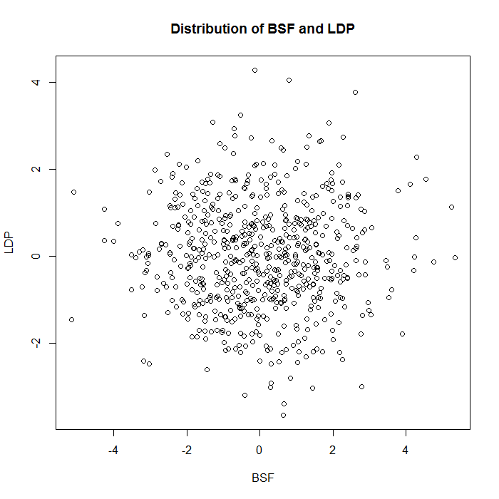
Now, another thing about this is that while we would think that BSF and LDP are correlated based on my qualitative descriptions, by construction there’s zero correlation between the two sets of values, so these are actually largely independent stats. Consider the plot below of BSF vs. LDP:
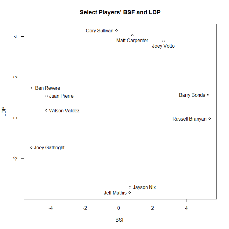
And this plot, which isolates some of the more extreme values:
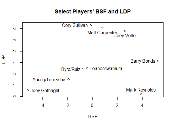
One final thing for this post: given that we have plotted these like coordinates, we can use the standard measure of distance between two points as a measure for similarity. For this, I’m going to change tacks slightly and use the first The two players most like each other in this sample form a slightly unlikely pair: Marlon Byrd, with coordinates (-0.756, 0.395), and Carlos Ruiz (-0.755, 0.397).
As you see below, if you look at their batted ball profiles, they don’t appear to be hugely similar. I spent a decent amount of time playing around with this; if you increase the number of components used from two to three or more, the similar players look much more similar in terms of these statistics. However, that gets away from the point of PCA, which is to abstract away from the data a bit. Thus, these pairs of similar players are players who have very similar amounts of BSF and LDP, rather than players who have the most similar statistics overall.
| Name | LD% | GB% | FB% | IFFB% | HR/FB | BB% | K% |
|---|---|---|---|---|---|---|---|
| Carlos Ruiz | 0.198 | 0.455 | 0.255 | 0.092 | 0.074 | 0.098 | 0.111 |
| Marlon Byrd | 0.206 | 0.471 | 0.241 | 0.082 | 0.093 | 0.064 | 0.180 |
Another pair that’s approximately as close as Ruiz and Byrd is Mark Teahen (-0.420,-0.491) and Akinori Iwamura (-0.421,-0.490), with the third place pair being Yorvit Torrealba (-1.919, -0.500) and Eric Young (-1.909, -0.497), who are seven times farther apart than the first two pairs.
Who stands out as outliers? It’s not altogether surprising if you look at the labelled charts above, though not all of them are labelled. (Also, be wary of the scale—the graph is a bit squished, so many players are farther apart numerically than they appear visually.) Joey Gathright turns out to be by far the most unusual player in our data—the distance to his closest comp, Einar Diaz, is more than 1000x the distance from Ruiz to Byrd, more than thirteen times the average distance to a player’s nearest neighbor, and more than eleven standard deviations above that average nearest neighbor difference.
In this case, though, having a unique style doesn’t appear to be beneficial. You’ll note Gathright is at the bottom of the BSF list, and he’s pretty far down the LDP list as well, meaning that he somehow stumbled into a seven year career despite having no power of any sort. Given that he posted an extremely pedestrian 0.77 bWAR per 150 games (meaning about half as valuable as an average player), hit just one home run in 452 games, and had the 13th lowest slugging percentage of any qualifying non-pitcher since 1990, we probably shouldn’t be surprised that there’s nobody who’s quite like him.
The rest of the players on the outliers list are the ones you’d expect—guys with extreme values for one or both statistics: Joey Votto, Barry Bonds, Cory Sullivan, Matt Carpenter, and Mark Reynolds. Votto is the second biggest outlier, and he’s less than two thirds as far from his nearest neighbor (Todd Helton) as Gathright is from his. Two things to notice here:
- To reiterate what I just said about Gathright, style doesn’t necessarily correlate with results. Cory Sullivan hit a lot of line drives (28.2%, the largest value in my sample—the mean is 20.1%) and popped out infrequently (3%, the mean is 10.1%). His closest comps are Matt Carpenter and Joe Mauer, which is pretty good company. And yet, he finished as a replacement level player with no power. Baseball is weird.
- Many of the most extreme outliers are players where we are missing a big chunk of their careers, either because they haven’t actually had them yet or because the data are unavailable. Given that there’s some research indicating that various power-related statistics change with age, I suspect we’ll see some regression to the mean for guys like Votto and Carpenter. (For instance, I imagine Bonds’s profile would look quite different if it included the first 16 years of his career.)
This chart shows the three tightest pairs of players and the six biggest outliers:
This is a bit of a lengthy post without necessarily an obvious point, but, as I said at the beginning, exploratory data analysis can be plenty interesting on its own, and I think this turned into a cool way of classifying hitters based on certain styles. An obvious extension is to find some way to merge both results and styles into one PCA analysis (essentially combining what I did with the Bill James/BR Similarity Score mentioned above), but I suspect that’s a big question, and one for another time.
If you’re curious, here’s a link to a public Google Doc with my principal components, raw data, and nearest distances and neighbors, and below is the promised table of PCA breakdown:
| PC1 | PC2 | PC3 | PC4 | PC5 | PC6 | PC7 | |
|---|---|---|---|---|---|---|---|
| LD% | -0.030 | 0.676 | -0.299 | -0.043 | 0.629 | 0.105 | -0.210 |
| GB% | -0.459 | 0.084 | 0.593 | 0.086 | -0.044 | 0.020 | -0.648 |
| FB% | 0.526 | 0.093 | -0.288 | -0.226 | -0.434 | -0.014 | -0.626 |
| IFFB% | -0.067 | -0.671 | -0.373 | 0.247 | 0.442 | -0.071 | -0.379 |
| HR/FB | 0.459 | -0.137 | 0.347 | 0.113 | 0.214 | 0.769 | -0.000 |
| BB% | 0.375 | 0.205 | 0.156 | 0.808 | -0.012 | -0.373 | -0.000 |
| K% | 0.394 | -0.126 | 0.437 | -0.461 | 0.415 | -0.503 | 0.000 |
| Proportion of Variance | 0.394 | 0.218 | 0.163 | 0.102 | 0.069 | 0.053 | 0.000 |
| Cumulative Proportion | 0.394 | 0.612 | 0.775 | 0.877 | 0.947 | 1.000 | 1.000 |
