I have a post over at the Hardball Times today about a way to improve replay review. Check it out!
Does the Call Need to Stand?
Leave a reply
I have a post over at the Hardball Times today about a way to improve replay review. Check it out!
Summary: I look at averages for hitters and pitchers in the postseason to see how their quality (relative to league average) has changed over time. Unsurprisingly, the gap between postseason and regular season average pitchers is larger than the comparable gap for hitters. The trend over time for pitchers is expected, with a decrease in quality relative to league average from the 1900s to mid-1970s and a slight increase since then that appears to be linked with the increased usage of relievers. The trend for hitters is more confusing, with a dip from 1950 to approximately 1985 and an increase since then. Overall, however, the average quality of both batters and pitchers in the postseason relative to league average is as high as it has been in the expansion era.
Quality of play in the postseason is a common trope of baseball discussion. Between concerns about optics (you want casual fans to watch high quality baseball) and rewarding the best teams, there was a certain amount of handwringing about the number of teams with comparatively poor records into the playoffs (e.g., the Giants and Royals made up the only pair of World Series teams ever without a 90 game winner). This prompted me to wonder about the quality of the average players in the postseason and how that’s changed over time with the many changes in the game—increased competitive balance, different workloads for pitchers, changes in the run environment, etc.
For pitchers, I looked at weighted league-adjusted RA9, which I computed as follows:
You can think of this as the expected result you would get if you chose a random plate appearance during the playoffs and looked at the pitcher’s RA9. Four caveats here:
When I plot that number over time, I get the following graph. The black dots are observed values, and the ugly blue line is a smoothed rolling estimate (using LOESS). (The gray is the confidence interval for the LOESS estimate.)

While I wouldn’t put too much weight in the LOESS estimate (these numbers should be subject to a large bit of randomness), it’s pretty easy to come up with a basic explanation of why the curve looks the way it does. For the first seventy years of that chart, the top pitchers pitched ever smaller shares of the overall innings (except for an uptick in the 1960s), ceding those innings to lesser starters and dropping the average quality. However, starting in the 1970s, relievers have covered larger portions of innings (covered in this FiveThirtyEight piece), and since relievers are typically more effective on a rate basis than starters, that’s a reasonable explanation for the shape of the overall pitcher trend.
What about hitters? I did the same calculations for them, using wOBA instead of RA9 and excluding pitchers from both postseason and league average calculations. (Specifically, I used the static version of wOBA that doesn’t have different coefficients each year. The coefficients used are the ones in The Book.) Again, this includes no park adjustments and rolls the two leagues together for the league average calculation. Here’s what the chart looks like:

Now, for this one I have no good explanation for the trend curve. There’s a dip in batter quality starting around integration and a recovery starting around 1985. If you have ideas about why this might be happening, leave them in the comments or Twitter. (It’s also quite possible that the LOESS estimate is picking up something that isn’t really there.)
What’s the upshot of all of this? This is an exploratory post, so there’s no major underlying point, but from the plots I’m inclined to conclude that, relative to average, the quality of the typical player (both batter and pitcher) in the playoffs is as good as it’s been since expansion. (To be clear, this mostly refers to the 8 team playoff era of 1995–2011; the last few years aren’t enough to conclude anything about letting two more wild cards in for a single game.) I suspect a reason for that is that, while the looser postseason restrictions have made it easier for flawed teams to make it in the playoffs, they’ve also made it harder for very good teams to be excluded because of bad luck, which lifts the overall quality, a point raised in this recent Baseball Prospectus article by Sam Miller.
Two miscellaneous tidbits from the preparation of this article:

I wrote an article for The Hardball Times about using subterfuge to obtain the platoon advantage. Check it out here.
Summary: Based on a suggestion heard at SaberSeminar, I use a few different means to examine how rookie umpires call the strike zone. Those seven umpires appear to consistently call more low strikes than the league as a whole, but some simple statistics suggest it’s unlikely they are actually moving the needle.
Red Sox manager John Farrell was one of the speakers at Saberseminar, which I attended last weekend. As I mentioned in my recap, he was asked about the reasons offense is down a hair this year (4.10 runs per team per game as I type this, down from 4.20 through this date (4.17 overall) in 2013). He mentioned a few things, but one that struck me was his suggestion that rookie umpires calling a larger “AAA strike zone” might have something to do with it.
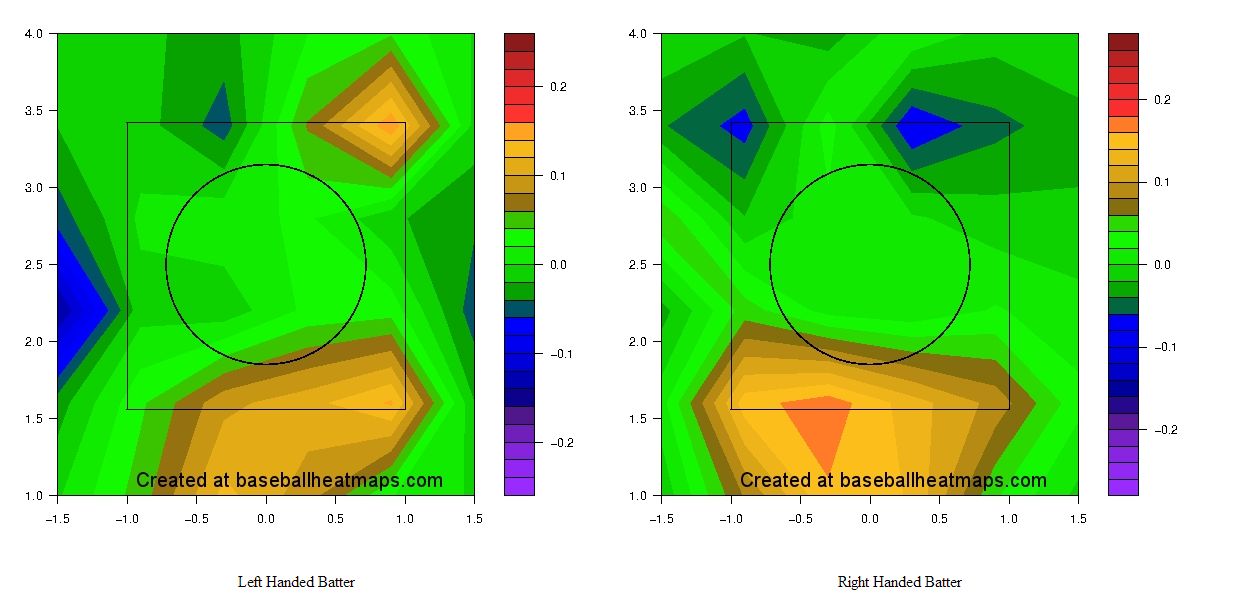
Of course, that’s something we can examine using some empirical evidence. Using this Hardball Talk article as a guide, I identified the seven new umpires this year. (Note that they are new to being full-fledged umps, but had worked a number of games as substitutes over the last several years.) I then pulled umpire strike zone maps from the highly useful Baseball Heat Maps, which I’ve put below. Each map shows the comparison between the umpire* and league average, with yellow marking areas more likely to be called strikes and blue areas less likely to be called strikes by the umpire.
* I used the site’s settings to add in 20 pitches of regression toward the mean, meaning that the values displayed in the charts are suppressed a bit.
Jordan Baker:

Lance Barrett:
Cory Blaser:

Mike Estabrook:

Mike Muchlinski:

David Rackley:

D.J. Reyburn:

The common thread, to me, is that almost all of them call more pitches for strikes at the bottom of the zone, and most of them take away outside strikes for some batters. Unfortunately, these maps don’t adjust for the number of pitches thrown in each area, so it’s hard to get aggregate figures for how many strikes below or above average the umpires are generating. The two charts below, from Baseball Savant, are a little more informative; red dots are the bars corresponding to rookie umps. (Labeling was done by hand in MS Paint, so there may be some error involved.)


The picture is now a bit murkier; just based on visual inspection, it looks like rookie umps call a few strikes more than average on pitches outside the zone, and maybe call a few extra balls on pitches in the zone, so we’d read that as nearly a wash, but maybe a bit on the strike side.
So, we’ve now looked at their strike zones adjusted for league average but not the number of pitches thrown and their strike zones adjusted for the relative frequencies of pitches but not seriously adjusted for league average. One more comparison, since I wasn’t able to find a net strikes leaderboard, is to use aggregate ball/strike data, which has accurate numbers but is unadjusted for a bunch of other stuff. Taking that information from Baseball Prospectus and subtracting balls in play from their strikes numbers, I find that rookie umps have witnessed in total about 20 strikes more than league average would suggest, though that’s not accounting for swinging vs. called or the location that pitches were thrown. (Those are substantial things to consider, and I wouldn’t necessarily expect them to even out in 30 or so games.)
At 0.12 runs per strike (a figure quoted by Baseball Info Solutions at the conference) that’s about 2.4 runs, which is about 0.4% of the gap between this year’s scoring and last year’s. (For what it’s worth, BIS showed the umpires who’d suppressed the most offense with their strike zones, and if I remember correctly, taking the max value and applying it to each rookie would be 50–60 total runs, which is still way less than the total change in offense.)
A different way of thinking about it is that the rookie umps have worked 155 games, so they’ve given up an extra strike every 8 or so games, or every 16 or so team-games. If the change in offense is 0.07 runs per team-game, that’s about one strike per game. So these calculations, heavily unadjusted, suggest that rookie umpires are unlikely to account for much of the decrease in scoring.
So, we have three different imperfect calculations, plus a hearsay back of the envelope plausibility analysis using BIS’s estimates, that each point to a very small effect from rookie umps. Moreover, rookie umps have worked 8.3% of all games and 8.7% of Red Sox games, so it seems like an odd thing for Farrell to pick up on. It’s possible that a more thorough analysis would reveal something big, but based on the data easily available I don’t think it’s true that rookie umpires are affecting offense with their strike zones.
I was fortunate enough to be at SaberSeminar this past weekend, held at Boston University and organized by (among others) Dan Brooks, the titular Brooks of PitchF/X site BrooksBaseball. I took some notes throughout the weekend, and I’ve typed them up below, broken into smaller observations. (All of the reflection was done on the bus home, so any mistakes are my own due to typing with a fried brain.)
One other thing to tell is that I presented some research I did on shifts in the strike zone (it actually came out of this article about high socks), and I’m going to be writing that up as an article soon, though it may appear at a different site. All in all, quite an enjoyable weekend even after factoring in the scattered criticisms below.
It was my first time at a baseball conference and the first time I’d been at any conference in quite some time, and it actually struck me as pretty similar to an indie music festival. The crowd wasn’t huge (a couple hundred people), and they all knew most of the speakers, who mostly stuck to greatest hits sort of things. (Most of what I saw presented wasn’t novel, especially by the more prominent folk.) That’s not to take away from the sessions—it was still interesting to meet and hear people that I had only read, and it was still great to be around a group where everyone was interested in the same sort of stuff and you could bring up things like SIERA and wOBA without much risk of confusion.
They had a panel discussion featuring three of the Red Sox baseball operations interns, and I was reminded of how skeezy some aspects of that system are. The moderator talked about how there were fewer MLB intern slots than there used to be because the feds cracked down on illegal internships, which he framed as a bad thing. I found that a bit horrifying; it seems odd to me that a team with a payroll of hundreds of millions would cut staff rather than pay a semi-reasonable wage to their junior people. (Even if it makes economic sense, it seems like a bad way to treat people.)
The interns, for their part, didn’t offer a whole lot of insight into things. (Not that I blame them; it’s hard to be insightful during a panel discussion.) They twice dodged the question of how many hours they work, only saying “a lot.” (It’s possible I’m being too harsh and they actually don’t know; because I’m billed out by the hour at work, I have to keep very accurate time logs, which means I know how much I’ve worked every week since I’ve started, but I may be an outlier in that regard.) One of the failings of the panel was that it didn’t include anyone who had been an intern and washed out (either quit or wasn’t offered a job), which would have been more informative and more interesting. (I understand not wanting to irk any of the teams, but I don’t think this is too inflammatory.) This is the same problem I ran into in college a lot, where most of the advice I got about whether to get a Ph.D. came from people who had not only loved grad school but also met with astounding success afterward.
I also thought about the fact that they are hiring recent grads of extremely expensive schools (Columbia, Yale, and Georgetown, in this case) to be extremely underpaid interns; I wonder how much of their labor pool is indirectly disqualified simply due to a lack of connections or a need to make money for family or student loan reasons. It’s very puzzling to me that teams, despite being flush with cash, hire people similarly to high-prestige, low-money companies like magazines rather than high-prestige, rich firms like banks and tech companies. I’d love to see more discussion from people who know more about the industry than I do.
One mostly unstated theme that kept occurring to me throughout the weekend was the issue of class, opportunity, and privilege, which popped up in a number of different ways:
There were a number of talks with a more medical and scientific focus, and they provided good examples of how hard it is to apply these things rigorously to baseball (or any other real world application). There are lots of studies with very small N (“N=4” appeared on one slide describing research that had been published), and they are presumably subject to the same sorts of issues that all public health and social science papers are. While I’m sure lots of teams (in all sports) would love to bring in scientists to help them with things like sleep and vision, I imagine there’s a lot of stuff that falls apart between the lab and the field (if it even exists at all).
I should mention that the first talk of the conference, by a UC-Riverside professor who focuses on vision, did have experimental evidence of how improved vision helps college player performance, but it’s still tiny samples and only college students, and thus to be taken with a grain of salt.
There was an interesting panel featuring Matt Swartz, Ben Baumer, and Vince Gennaro discussing the relationship between winning and teams’ making money that prompted at least a couple article ideas for the future. Gennaro said he thought that the way teams spend money might change a bit after the addition of the second wild card, as there is now much greater variety across playoff teams in terms of how valuable the postseason slot is—the first seed became more valuable and the wild card slots substantially less. I have some thoughts on that, but will leave them for future articles.
Astros’ GM Jeff Luhnow gave a pleasant enough if relatively fact-free talk, the main focus of which was the importance of convincing the uniformed personnel of the importance of the sabermetric principles that buck conventional wisdom. He used the example of the shift and how it took the Astros three years to actually get people on board with it; obviously, if the players and the manager don’t like it, it won’t work as well as it would otherwise. I honestly wouldn’t be surprised if this becomes much less of an issue in 10 or so years, when the reasoning will have permeated a bit more through the baseball establishment and managers and young players will be a lot more open to things.
Vince Gennaro gave a very similar talk, and one thing he brought up was that you need to strike a balance between sticking to general principles (about shifting, pitcher workload, etc.) and making exceptions where warranted. Given that Luhnow talked about how he had made too many exceptions about when to shift last year, the point was hammered home, though it’s a vague enough point that it’s hard to really implement. (I was also reminded of this recent article about Ruben Amaro and exceptions.)
While Red Sox GM Ben Cherington didn’t discuss anything much more novel than what Luhnow covered, he was a lot more personable and down-to-earth while doing so. I imagine some of that is personality and a lot of it is the result of being the GM of the defending World Series champs and talking in his own backyard instead of presiding over three years of horrible teams and a lot of criticism from around baseball.
The last question asked of Luhnow was a minute-long ramble that wasn’t really a question and basically turned into “haha, you screwed up the Brady Aiken situation,” and Luhnow looked pretty peeved afterward, prompting Dan Brooks to tell the crowd not to be jerks to the presenters. There were a lot of bad questions all weekend, especially to Cherington, Red Sox manager John Farrell, and Luhnow, who clearly couldn’t say anything about their teams to us that was any more interesting than what they tell the media after a game. That didn’t stop people from bugging Farrell about his bullpen, though.
There was a bit more offensive humor in some of the talks than I would have expected—one professor made a joke about George W. Bush being brain damaged, and another managed to have a slide showing him wearing a t shirt that said “Drunk Bitches Love Me,” a slide with a cartoon captioned “I Will Fucking Cut You, Bitch,” and threw in a couple fat jokes for good measure. As anyone who knows me will attest, I have a reasonably sharp sense of humor, but throwing around jokes with misogynistic overtones at a conference that I would estimate was 90–95% men made me cringe.
More bullets from John Farrell’s talk:
Russell Carleton gets major points for treating data as a plural noun rather than a singular one; he was the only one I noticed doing that all conference. I’d be curious to see what the usage rates are depending on background, with my guess being that people with more academic experience use “are” more than people who mostly use data in a private sector setting. (Yes, I’m a pedant about some of these things.)
Two White Sox notes from people’s presentations:
Another one of those themes that kept popping up to me during the weekend was the idea of how teams preserve their edges, especially the ones they derive through quantitative and sabermetric means. (I’m reminded of the Red Queen hypothesis, which is an evolutionary biology idea I learned about through quiz bowl that applies pretty well to baseball analysis. Basically, you have to keep advancing in absolute terms to stay in the same place relatively, because if you are complacent people will catch up to you naturally.) A few places that this issue manifested itself:
Several different people brought up StatCast, which is the new data collection system MLB Advanced Media is going to roll out some time soon; it will provide a huge amount of data on how fast players move and how quickly they react that will allow for analysis that’s a bit more along the lines of what the SportVU cameras do in basketball. (See the videos in the above link for examples.) There’s still no sense of whether or not it will be made public (and in what form it might be made public), but people were uniformly excited about it.
The projections folk were united in the belief that it would have a huge effect on projecting defense, to the point where MGL thinks defense will go from being the hardest component of the sport to analyze and predict to the easiest. There was a bit more divergence about what it might do for pitching and batting analysis, as well as about when it would come out—one speaker quoted MLB and said it would be ready to go by the beginning of next year, whereas Dave Cameron pointed out that test data hadn’t been released to the teams yet despite what was originally promised and thus thought it was highly unlikely that the data would be ready for teams by next year, much less ready for public consumption.
Dan Brooks jokingly introduced a hitting metric he called “GIP,” for Google Images Performance. It was prompted by the fact that a Google search for “miguel cabrera hitting” or “david ortiz hitting” finds pictures of them hitting home runs, whereas a query for “jose molina hitting” gets mostly pictures of him behind the plate.
More notes from Tippett’s talk:
Quick summary: I test the ZiPS and Marcel projection systems to see if their errors are larger for players with larger platoon splits. A first check says that they are not, though a more nuanced examination of the system remains to be conducted.
First, a couple housekeeping notes:
After the A’s went on their trading sprees last week at the trading deadline, there was much discussion about how they were going to intelligently deploy the rest of their roster to cover for the departure of Yoenis Cespedes. This is part of a larger pattern with the A’s as they continue to be very successful with their platoons and wringing lots of value out of their depth. Obviously, when people have tried to determine the impact of this trade, they’ve been relying on projections for each of the individual players involved.
What prompted my specific question is that Jonny Gomes is one of those helping to fill Cespedes’s shoes, and Gomes has very large platoon splits. (His career OPS is .874 against left-handed pitchers and .723 against righties.) The question is what proportion of Gomes’s plate appearances the projection systems assume will be against right handers; one might expect that if he is deployed more often against lefties than the system projects, he might beat the projections substantially.
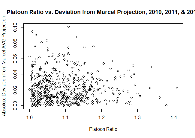
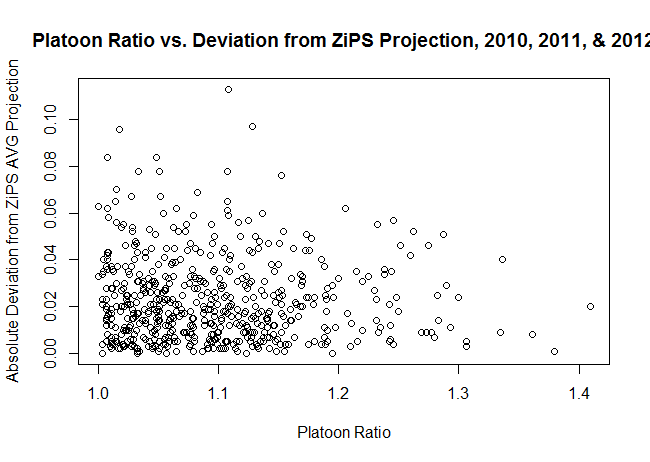
Since Jonny Gomes in the second half of 2014 constitutes an extremely small sample, I decided to look at a bigger pool of players from the last few years and see if platoon splits correlated at all with a player beating (or missing) preseason projections. Specifically, I used the 2010, 2012, and 2013 ZiPS and Marcel projections (via the Baseball Projection Project, which doesn’t have 2011 ZiPS numbers).
A bit of background: ZiPS is the projection system developed by Dan Szymborski, and it’s one of the more widely used ones, if only because it’s available at FanGraphs and relatively easy to find there. Marcel is a very simple projection system developed by Tangotiger (it’s named after the monkey from Friends) that is sometimes used as a baseline for other projection systems. (More information on the two systems is available here.)
So, once I had the projections, I needed to come up with a measure of platoon tendencies. Since the available ZiPS projections only included one rate stat, batting average, I decided to use that as my measure of batting success. I computed platoon severity by taking the larger of a player’s BA against left-handers and BA against right-handers and dividing by the smaller of those two numbers. (As an example, Gomes’s BA against RHP is .222 and against LHP is .279, so his ratio is .279/.222 = 1.26.) My source for those data is FanGraphs.
I computed that severity for players with at least 500 PA against both left-handers and right-handers going into the season for which they were projected; for instance, for 2010 I would have used career data stopping at 2009. I then looked at their actual BA in the projected year, computed the deviation between that BA and the projected BA, and saw if there was any correlation between the deviation and the platoon ratio. (I actually used the absolute value of the deviation, so that magnitude was taken into account without worrying about direction.) Taking into account the availability of projections and requiring that players have at least 150 PA in the season where the deviation is measured, we have a sample size of 556 player seasons.
As it turns out, there isn’t any correlation between the two parameters. My hypothesis was that there’d be a positive correlation, but the correlation is -0.026 for Marcel projections and -0.047 for ZiPS projections, neither of which is practically or statistically significantly different from 0. The scatter plots for the two projection systems are below:
Now, there are a number of shortcomings to the approach I’ve taken:
So, if you’re looking for a takeaway, it’s that large platoon-split players on the whole do not appear to be poorly projected (for BA by ZiPS and Marcel), but it’s still possible that those with a large change in circumstances might differ from their projections.
Short summary: I look at how much year-over-year persistence there is in the lists of best position players and pitchers, using Wins Above Replacement (WAR). It appears as though there is substantial volatility, with only the very best players being more likely than not to repeat on the lists. In the observed data, pitchers are slightly more likely to remain at the top of the league than position players, but the difference is not meaningful.
Last week, Sky Kalkman posted a question that I thought seemed interesting.
Sky’s Theorem: the group of aces has a half-life of two years. If you’re an ace, 50/50 you’re one in two years. Anyone want to research it?
— Sky Kalkman (@Sky_Kalkman) July 9, 2014
Obviously, this requires having a working definition of “ace,” for which Kalkman later suggests “the top dozen-ish” pitchers in baseball. That seems reasonable to me, but it raises another question: what metric to use for “top”?
I eventually wound up using an average of RA9-WAR and FIP-WAR (the latter being the standard WAR offered by FanGraphs). There are some drawbacks to using counting stats rather than a rate stat, specifically that a pitcher that misses two months due to injury might conceivably be an ace but won’t finish at the top of the leaderboard. That said, my personal opinion is that health is somewhat of a skill and dependability is part of being an ace.
I chose to use this blend of WAR (it’s similar to what Tangotiger sometimes says he uses) because I wanted to incorporate some aspects of Fielding Dependent Pitching into the calculations. It’s a bit arbitrary, but the analysis I’m about to present doesn’t change much if you use just FIP-WAR or plain old FIP- instead.
I also decided to use the period from 1978 to the present as my sample; 1978 was the expansion that brought the majors to 26 teams (close to the present 30), keeping the total pool of talent reasonably similarly-sized throughout the entire time period while still providing a reasonably large sample size.
So, after collecting the data, what did I actually compute? I worked with two groups—the top 12 and top 25 pitchers by WAR in a given year—and then looked at three things. I first examined the probability they would still be in their given group the next year, two years after, and so on up through 10 years following their initial ace season. (Two notes: I included players tied for 25th, and I didn’t require that the seasons be consecutive, so a pitcher who bounced in and out of the ace group will still be counted. For instance, John Smoltz counts as an ace in 1995 and 2005 in this system, but not for the years 2001–04. He’s still included in the “ace 10 years later” group.) As it turns out, the “half-life” that Kalkman postulates is less than a year: 41% of top 25 pitchers are in the top 25 the next year, with that figure dropping to 35% for top 12 pitchers who remain in the top 12.
I also looked at those probabilities by year, to see if there’s been any shift over time—basically, is the churn greater or less than it used to be? My last piece of analysis was to look at the probabilities by rank in the initial year to see how much more likely the very excellent pitchers are to stay at the top than the merely excellent pitchers. Finally, I ran all of these numbers for position players as well, to see what the differences are and provide some additional context for the numbers.
I played around and ultimately decided that some simple charts were the easiest way to convey what needed to be said. (Hopefully they’re of acceptable quality—I was having some issues with my plotting code.) We’ll start with the “half-life” graph, i.e. the “was this pitcher still an ace X years later?” chart.
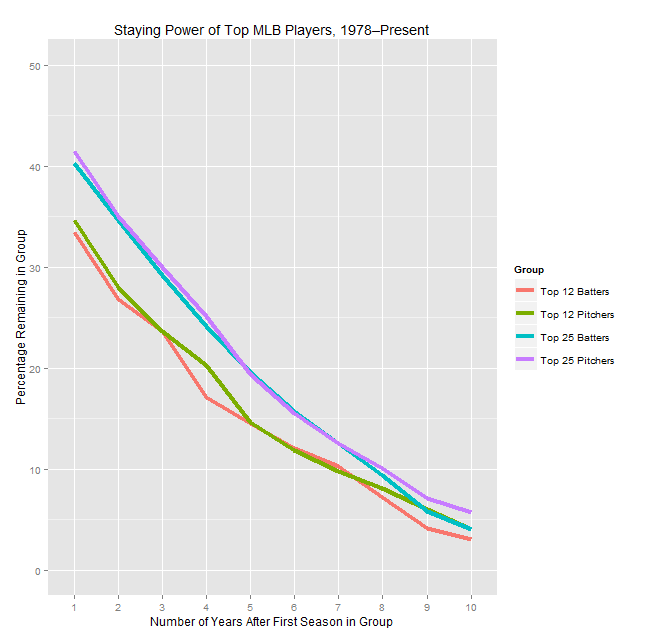
As you can see, there’s a reasonable amount of volatility, in that the typical pitcher who cracks one of these lists won’t be on the same list the next year. While there’s a small difference between pitchers and position players for each group in the one year numbers, it’s not statistically significant and the lines blur together when looking at years further out, so I don’t think it’s meaningful.
Now, what if we look at things by year? (Note that from here on out we’re only looking at the year-over-year retention rate, not rates from two or more years.)

This is a very chaotic chart, so I’ll explain what I found and then show a slightly less noisy version. The top 25 groups aren’t correlated with each other, and top 25 batters isn’t correlated with time. However, top 25 pitchers is lightly positively correlated with time (r = 0.33 and p = 0.052), meaning that the top of the pitching ranks has gotten a bit more stable over the last 35 years. Perhaps more interestingly, the percentage for top 12 pitchers is more strongly positively correlated with time (r = 0.46, p < 0.01), meaning that the very top has gotten noticeably more stable over time (even compared to the less exclusive top), whereas the same number for hitters is negative (r = -0.35, p = 0.041), meaning there’s more volatility at the top of the hitting WAR leaderboard than there used to be.
These effects should be more visible (though still noisy) in the next two charts that show just the top 12 numbers (one’s smoothed using LOESS, one not). I’m reluctant to speculate as to what could be causing these effects: it could be related to run environments, injury prevention, player mobility, or a whole host of other factors, so I’ll leave it alone for now. (The fact that any explanation might have to also consider why this effect is stronger for the top 12 than the top 25 is another wrinkle.)


The upshot of these graphs, though, is that (if you buy that the time trend is real) the ace half-life has actually increased over the last couple decades, and it’s gone down for superstar position players over the same period.
Finally, here’s the chart showing how likely a player who had a given rank is to stay in the elite group for another year. This one I’ve also smoothed to make it easier to interpret:

What I take away from these charts are that, unsurprisingly, the very best players tend to persist in the elite group for multiple years, but that the bottom of the top is a lot less likely to stay in the group. Also, the gaps at the far left of the graph (corresponding to the very best players) are larger than the gaps we’ve seen between pitchers and hitters anywhere else. This says that, in spite of pitchers’ reputation as being volatile, at the very top they have been noticeably less prone to large one-year drop offs than the hitters are. That said, the sample is so small (these buckets are a bit larger than 30 each) that I wouldn’t take that as predictive so much as indicative of an odd trend.
In the last piece I wrote, I mentioned that I have some concerns about the way that people tend to think about defense independent pitching statistics (DIPS), especially FIP. (Refresher: Fielding Independent Pitching is a metric commonly used as an ERA estimator based on a pitcher’s walk, strikeout, and HR numbers.) I’m writing this piece in part as a way for me to sort some of my thoughts on the complexities of defense and park adjustments, not necessarily to make a single point (and none of these thoughts are terribly original).
All of this analysis starts with this equation, which is no less foundational for being almost tautological: Runs Allowed = Fielding Independent Pitching + Fielding Dependent Pitching. (Quick aside: Fielding Independent Pitching refers both to a concept and a metric; in this article, I’m mostly going to be talking about the concept.) In other words, there are certain ways of preventing runs that don’t rely on getting substantial aid from the defense (strike outs, for instance), and certain ways that do (allowing soft contact on balls in play).
In general, most baseball analysts tend to focus on the fielding independent part of the equation. There are a number of good reasons for this, the primary two being that it’s much simpler to assess and more consistent than its counterpart. There’s probably also a belief that, because it’s more clearly intrinsic to the pitcher, it’s more worthwhile to understand the FI portion of pitching. There are pitchers for whom we shy away from using the FI stats (like knuckleballers), but if you look at the sort of posts you see on FanGraphs, they’ll mostly be talking about performance in those terms.
That’s not always (or necessarily ever) a problem, but it often omits an essential portion of context. To see how, look at these three overlapping ways of framing the question “how good has this pitcher been?”:
1) If their spot on their team were given to an arbitrary (replacement-level or average) pitcher, how much better or worse would the team be?
2) If we took this pitcher and put them on a hypothetically average team (average in terms of defense and park, at least), how much better or worse would that team be?
3) If we took this pitcher and put them on a specific other team, how much better or worse would that team be?
Roughly speaking, #2 is how I think of FanGraphs’ pitcher WAR. #1 is Baseball Reference’s WAR. I don’t know of anywhere that specifically computes #3, but in theory that’s what you should get out of a projection system like Baseball Prospectus’s PECOTA or the ZiPS numbers found at FanGraphs’. (In practice, my understanding is that the projections aren’t necessarily nuanced enough to work that out precisely.)
The thing, though, is that pitchers don’t work with an average park and defense behind them. You should expect a fly ball pitcher to post better numbers with the Royals and their good outfield defense and a ground ball pitcher to do worse in front the butchers playing in the Cleveland infield. From a team’s perspective, though, a run saved is a run saved, and who cares whether it’s credited to the defense, the pitcher, or split between the two? If Jarrod Dyson catches the balls sent his way, it’s good to have a pitcher who’s liable to have balls hit to him. In a nutshell, a player’s value to his team (or another team) is derived from the FIP and the FDP, and focusing on the FIP misses some of that. Put your players in the best position for them to succeed, as the philosophy often attributed to Earl Weaver goes.
There are a number of other ways to frame this issue, which, though I’ve been talking in terms of pitching, clearly extends beyond that into nearly all of the skills baseball players demonstrate. Those other frames are all basically a restatement of that last paragraph, so I’ll try to avoid belaboring the point, but I’ll add one more example. Let’s say you have two batters who are the same except for 5% of their at-bats, which are fly balls to left field for batter A and to right field for batter B. By construction, they are players of identical quality, but player B is going to be worth more in Cleveland, where those fly balls are much more likely to go out of the park. Simply looking at his wRC+ won’t give you that information. (My limited knowledge of fantasy baseball suggests to me that fantasy players, because they use raw stats, are more attuned to this.)
Doing more nuanced contextual analysis of the sort I’m advocating is quite tricky and is beyond my (or most people’s) ability to do quickly with the numbers we currently have available. I’d still love, though, to see more of it, with two things in particular crossing my mind.
One is in transaction analysis. I read a few pieces discussing the big Samardzija trade, for instance, and in none did they mention (even in passing) how his stuff is likely to play in Oakland given their defense and park situation. This isn’t an ideal example because it’s a trade with a lot of other interesting aspects to it, but in general, it’s something I wish I saw a bit more of—considering the amount of value a team is going out of a player after adjusting for park and defense factors. The standard way of doing this is to adjust things from his raw numbers to a neutral context, but bringing things one step further, though challenging, should add another layer of nuance. (I will say that in my experience you see such analyses a bit more with free agency analyses, especially of pitchers.)
The second is basically expanding what we think of as being park and defensive adjustments. This is likely impossible to do precisely without more data, but I’d love to see batted ball data used to get a bit more granular in the adjustments; for instance, dead pull hitters should be adjusted differently from guys who use the whole field. This isn’t anything new—it’s in the FanGraphs page explaining park factors—but it’s something that occasionally gets swept under the rug.
One last note, as this post gets ever less specific: I wonder how big the opportunity is for teams to optimize their lineups and rotations based on factors such as these—left-handed power hitters go against the Yankees, ground ball hitters against the Indians, etc. We already see this to some extent, but I’d be curious to see what the impact is. (If you can quantify how big an edge you’re getting on a batter-by-batter basis—a big if—you could run some simulations to quantify the gain from all these adjustments. It’s a complex optimization problem, but I doubt it’s impossible to estimate.)
One thing I haven’t seen that I’d love for someone to try is for teams with roughly interchangeable fourth, fifth, and sixth starters to juggle their pitching assignments each time through the order to get the best possible matchups with respect to park, opponent, and defense. Ground ball pitchers pitch at Comiskey, for instance, and fly ball pitchers start on days when your best outfield is out there. I don’t know how big the impact is, so I don’t want to linger on this point too much, but it seems odd that in the era of shifting we don’t discuss day-to-day adjustments very much.
And that’s all that I’m talking about with this. Defense- and park-adjusted statistics are incredibly valuable tools, but they don’t get you all the way there, and that’s an important thing to keep in mind when you start doing nuanced analyses.
Brief Summary:
Fielding Independent Pitching (FIP) is a popular alternative to ERA predicated on a pitcher’s strikeout, walk, and home run rates. The extent to which pitchers deserve credit for having FIPs better or worse than ERAs is something that’s poorly understood, though it’s usually acknowledged that certain pitchers do deserve that credit. Given that some of the non-random difference can be attributed to where a pitcher plays because of defense and park effects, I look at pitchers who change teams and consider the year-over-year correlation between their ERA-FIP differentials. I find that the correlation remains and is not meaningfully different from the year-over-year correlation for pitchers that stay on the same team. However, this effect is (confusingly) confounded with innings pitched.
After reading this Lewie Pollis article on Baseball Prospectus, I started thinking more about how to look at FIP and other ERA estimators. In particular, he talks about trying to assess how likely it is that a pitcher’s “outperforming his peripherals” (scare quotes mine) is skill or luck. (I plan to run a more conceptual piece on that FIP and other general issues soon.) That also led me to this FanGraphs community post on FIP, which I don’t think is all that great (I think it’s arguing against a straw man) but raises useful points about FIP regardless.
After chewing on all of that, I had an idea that’s simple enough that I was surprised nobody else (that I could find) had studied it before. Do pitchers preserve their FIP-ERA differential when they change teams? My initial hypothesis is that they shouldn’t, at least not to the same extent as pitchers who don’t change teams. After all, in theory (just to make it clear: in theory) most or much of the difference between FIP and ERA should be related to park and defensive effects, which will change dramatically from team to team. (To see an intuitive demonstration of this, look at the range of ERA-FIP values by team over the last decade, where each team has a sample of thousands of innings. The range is half a run, which is substantial.)
Now, this is dramatically oversimplifying things—for one, FIP, despite its name, is going to be affected by defense and park effects, as the FanGraphs post linked above discusses, meaning there are multiple moving parts in this analysis. There’s also the possibility that there’s either selection bias (pitchers who change teams are different from those who remain) or some treatment effect (changing teams alter’s a pitcher’s underlying talent). Overall, though, I still think it’s an interesting question, though you should feel free to disagree.
First, we should frame the question statistically. In this case, the question is: does knowing that a pitcher changed teams give us meaningful new information about his ERA-FIP difference in year 2 above and beyond his ERA-FIP difference in year 1. (From here on out, ERA-FIP difference is going to be E-F, as it is on FanGraphs.)
I used as data all consecutive pitching seasons of at least 80 IP since 1976. I’ll have more about the inning cutoff in a little bit, but I chose 1976 because it’s the beginning of the free agency era. I said that a pitcher changed teams if they played for one team for all of season 1 and another team for all of season 2; if they changed teams midseason in either season, they were removed from the data for most analyses. I had 621 season pairs in the changed group and 3389 in the same team group.
I then looked at the correlation between year 1 and year 2 E-F for the two different groups. For pitchers that didn’t change teams, the correlation is 0.157, which ain’t nothing but isn’t practically useful. In a regression framework, this means that the fraction of variation in year 2 E-F explained by year 1 E-F is about 2.5%, which is almost negligible. For pitchers who changed teams, the correlation is 0.111, which is smaller but I don’t think meaningfully so. (The two correlations are also not statistically significantly different, if you’re curious.)
Looking at year-to-year correlations without adjusting for anything else is a very blunt way of approaching this problem, so I don’t want to read too much into a null result, but I’m still surprised—I would have thought there would be some visible effect. This still highlights one of the problems with the term Fielding Independent Pitching—the fielders changed, but there was still an (extremely noisy) persistent pitcher effect, putting a bit of a lie to the term “independent” (though as before, there are a lot of confounding factors so I don’t want to overstate this). At some point, I’d like to thoroughly examine how much of this result is driven by lucky pitchers getting more opportunities to keep pitching than unlucky ones, so that’s one for the “further research” pile.
I had two other small results that I ran across while crunching these numbers that are tangentially related to the main point:
So, what does this all signify? As I said before, the result isn’t what I expected, but when working with connections that are this tenuous, I don’t think there’s a clear upshot. This research has, however, given me some renewed skepticism about the way FIP is often employed in baseball commentary. I think it’s quite useful in its broad strokes, but it’s such a blunt instrument that I would advise being wary of people who try to draw strong conclusions about its subtleties. The process of writing the article has also churned up some preexisting ideas I had about FIP and the way we talk about baseball stats in general, so stay tuned for those thoughts as well.
A few people kicked around some suggestions about my last piece on Tom Tango’s blog, so I’m following up with a couple more pieces of analysis that will hopefully shed some light on things. As a quick refresher, I looked at steal attempts with runners on the corners and found that the success rate is much larger than the break even point, especially with two outs. My research suggests teams are too conservative, i.e. they should send the runners more. For more about methods and data, look at the prior piece.
One initial correction from Tango is that I was treating one class of events improperly; that’s since been corrected. (Specifically, two out events where one runner is out and the other scores are now counted as successes, not failures.) Another point made by Peter Jensen is that I should consider what happens when the runners are moving and contact is made; that’s going to require a bit more grinding with the data, but it’s now on my list of things to look at.
Next, there were some questions about how much of the success rate is due to having abnormally good or bad runners. Here are two plots showing all successes and failures by the stolen base percentages of the runners on first and third. The first is for all situations, the second for two out situations only.
Quick data note: to compute attempts and stolen base percentage, I used a centered three-year average, meaning that if an attempt took place in 2010 the SB% fed in would be the aggregate figure from 2009–2011. These charts only include situations where both runners have at least 20 attempts.

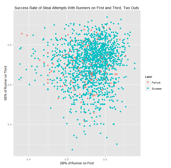
To simplify the charts a bit, I put the attempts into one of 36 buckets based on the SB% of the runners and then computed the success rates for those buckets; you can see the results in the tables below. The bucket boundaries are based on the distribution of SB%, so the 17th, 33rd, 50th, 67th, and 83rd percentiles. Sample sizes are roughly 55 for two outs (minimum 40) and 100-110 overall (minimum 73).
| Third Base SB% Bucket | ||||||
|---|---|---|---|---|---|---|
| 1st Base SB% Bucket | 27.3%—61.4% | 61.4%—68% | 68%—72.5% | 72.5%—75.8% | 75.8%—80% | 80%—95.5% |
| 33.3%—64.9% | 72.6 | 79.1 | 83.0 | 77.1 | 83.3 | 81.0 |
| 64.9%—70.6% | 80.3 | 85.6 | 80.8 | 88.2 | 86.8 | 87.1 |
| 70.6%—74.4% | 86.4 | 84.0 | 83.7 | 87.3 | 85.3 | 86.3 |
| 74.4%—77.6% | 85.6 | 85.9 | 91.4 | 86.4 | 92.7 | 89.8 |
| 77.6%—81.2% | 91.3 | 90.5 | 83.3 | 90.3 | 95.2 | 90.6 |
| 81.2%—96.2% | 90.8 | 84.9 | 89.4 | 90.8 | 93.6 | 89.1 |
| Third Base SB% Bucket | ||||||
|---|---|---|---|---|---|---|
| 1st Base SB% Bucket | 27.3%—60.9% | 60.9%—67.6% | 67.6%—72.1% | 72.1%—75.5% | 75.5%—80% | 80%—93.9% |
| 35%—64.1% | 86.9 | 89.2 | 87.7 | 84.6 | 92.5 | 89.4 |
| 64.1%—70.1% | 89.6 | 93.2 | 89.1 | 89.1 | 87.8 | 91.5 |
| 70.1%—74% | 92.7 | 85.7 | 91.7 | 96.6 | 93.3 | 91.5 |
| 74%—77.5% | 94.1 | 93.3 | 92.9 | 94.6 | 100.0 | 93.5 |
| 77.5%—81.1% | 95.0 | 87.7 | 94.4 | 93.5 | 98.2 | 97.1 |
| 81.1%—95.5% | 95.8 | 89.3 | 90.7 | 91.2 | 95.7 | 95.5 |
As you can see, even with noticeably below-average runners at both bases (average SB% is 70%), teams are successful so often that they should be trying it more often—all buckets but one in the two tables have a success rate above break-even. (BE rates are 75.5% overall and 69% for 2 outs.) There’s still a little bit of selection bias, which is pertinent, though I don’t think it accounts for most of the effect—see the note below. However, the fact that every single bucket comes in well above the break-even rate suggests to me that even accounting for the selection bias, this is still an area where managers should be more aggressive. At the very least, it seems that if there are two average base thieves on and two out, the runner on first should be going much more frequently than the current sub-10% attempt rate.
Note: One important thing to consider is that putting the attempts minimum in place noticeably increases the success rate—from 83% to 86% overall, and from 90% to 92% for two out situations. (The explanation for that is that really slow players don’t necessarily have poor SB%, they just have next to no stolen base attempts, so they are falling out of the data.) However, if you stick to the attempts where one or both runners have few attempts, the success rate only drops about 2 percentage points, which is still pretty far above the breakeven point overall and with two outs.
