Tag Archives: Pitching

The Shelf Life of Top Shelf Performances

Short summary: I look at how much year-over-year persistence there is in the lists of best position players and pitchers, using Wins Above Replacement (WAR). It appears as though there is substantial volatility, with only the very best players being more likely than not to repeat on the lists. In the observed data, pitchers are slightly more likely to remain at the top of the league than position players, but the difference is not meaningful.


Last week, Sky Kalkman posted a question that I thought seemed interesting.

Obviously, this requires having a working definition of “ace,” for which Kalkman later suggests “the top dozen-ish” pitchers in baseball. That seems reasonable to me, but it raises another question: what metric to use for “top”?

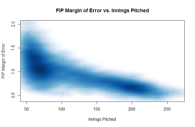
I eventually wound up using an average of RA9-WAR and FIP-WAR (the latter being the standard WAR offered by FanGraphs). There are some drawbacks to using counting stats rather than a rate stat, specifically that a pitcher that misses two months due to injury might conceivably be an ace but won’t finish at the top of the leaderboard. That said, my personal opinion is that health is somewhat of a skill and dependability is part of being an ace.

I chose to use this blend of WAR (it’s similar to what Tangotiger sometimes says he uses) because I wanted to incorporate some aspects of Fielding Dependent Pitching into the calculations. It’s a bit arbitrary, but the analysis I’m about to present doesn’t change much if you use just FIP-WAR or plain old FIP- instead.

I also decided to use the period from 1978 to the present as my sample; 1978 was the expansion that brought the majors to 26 teams (close to the present 30), keeping the total pool of talent reasonably similarly-sized throughout the entire time period while still providing a reasonably large sample size.

So, after collecting the data, what did I actually compute? I worked with two groups—the top 12 and top 25 pitchers by WAR in a given year—and then looked at three things. I first examined the probability they would still be in their given group the next year, two years after, and so on up through 10 years following their initial ace season. (Two notes: I included players tied for 25th, and I didn’t require that the seasons be consecutive, so a pitcher who bounced in and out of the ace group will still be counted. For instance, John Smoltz counts as an ace in 1995 and 2005 in this system, but not for the years 2001–04. He’s still included in the “ace 10 years later” group.) As it turns out, the “half-life” that Kalkman postulates is less than a year: 41% of top 25 pitchers are in the top 25 the next year, with that figure dropping to 35% for top 12 pitchers who remain in the top 12.

I also looked at those probabilities by year, to see if there’s been any shift over time—basically, is the churn greater or less than it used to be? My last piece of analysis was to look at the probabilities by rank in the initial year to see how much more likely the very excellent pitchers are to stay at the top than the merely excellent pitchers. Finally, I ran all of these numbers for position players as well, to see what the differences are and provide some additional context for the numbers.

I played around and ultimately decided that some simple charts were the easiest way to convey what needed to be said. (Hopefully they’re of acceptable quality—I was having some issues with my plotting code.) We’ll start with the “half-life” graph, i.e. the “was this pitcher still an ace X years later?” chart.

HalfLife

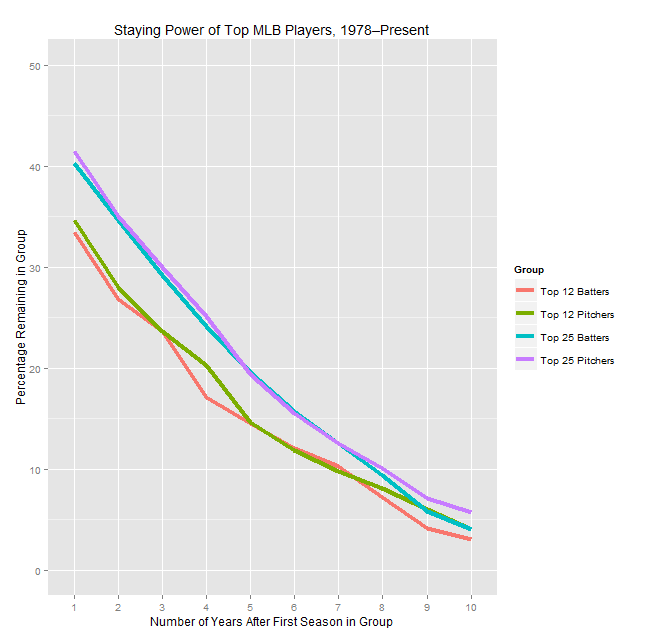
As you can see, there’s a reasonable amount of volatility, in that the typical pitcher who cracks one of these lists won’t be on the same list the next year. While there’s a small difference between pitchers and position players for each group in the one year numbers, it’s not statistically significant and the lines blur together when looking at years further out, so I don’t think it’s meaningful.

Now, what if we look at things by year? (Note that from here on out we’re only looking at the year-over-year retention rate, not rates from two or more years.)

AllByYear

This is a very chaotic chart, so I’ll explain what I found and then show a slightly less noisy version. The top 25 groups aren’t correlated with each other, and top 25 batters isn’t correlated with time. However, top 25 pitchers is lightly positively correlated with time (r = 0.33 and p = 0.052), meaning that the top of the pitching ranks has gotten a bit more stable over the last 35 years. Perhaps more interestingly, the percentage for top 12 pitchers is more strongly positively correlated with time (r = 0.46, p < 0.01), meaning that the very top has gotten noticeably more stable over time (even compared to the less exclusive top), whereas the same number for hitters is negative (r = -0.35, p = 0.041), meaning there’s more volatility at the top of the hitting WAR leaderboard than there used to be.

These effects should be more visible (though still noisy) in the next two charts that show just the top 12 numbers (one’s smoothed using LOESS, one not). I’m reluctant to speculate as to what could be causing these effects: it could be related to run environments, injury prevention, player mobility, or a whole host of other factors, so I’ll leave it alone for now. (The fact that any explanation might have to also consider why this effect is stronger for the top 12 than the top 25 is another wrinkle.)

12ByYear

SmoothByYear

The upshot of these graphs, though, is that (if you buy that the time trend is real) the ace half-life has actually increased over the last couple decades, and it’s gone down for superstar position players over the same period.

Finally, here’s the chart showing how likely a player who had a given rank is to stay in the elite group for another year. This one I’ve also smoothed to make it easier to interpret:

RankPlot

What I take away from these charts are that, unsurprisingly, the very best players tend to persist in the elite group for multiple years, but that the bottom of the top is a lot less likely to stay in the group. Also, the gaps at the far left of the graph (corresponding to the very best players) are larger than the gaps we’ve seen between pitchers and hitters anywhere else. This says that, in spite of pitchers’ reputation as being volatile, at the very top they have been noticeably less prone to large one-year drop offs than the hitters are. That said, the sample is so small (these buckets are a bit larger than 30 each) that I wouldn’t take that as predictive so much as indicative of an odd trend.

Advertisement

What’s the Point of DIPS, Anyway?

In the last piece I wrote, I mentioned that I have some concerns about the way that people tend to think about defense independent pitching statistics (DIPS), especially FIP. (Refresher: Fielding Independent Pitching is a metric commonly used as an ERA estimator based on a pitcher’s walk, strikeout, and HR numbers.) I’m writing this piece in part as a way for me to sort some of my thoughts on the complexities of defense and park adjustments, not necessarily to make a single point (and none of these thoughts are terribly original).

All of this analysis starts with this equation, which is no less foundational for being almost tautological: Runs Allowed = Fielding Independent Pitching + Fielding Dependent Pitching. (Quick aside: Fielding Independent Pitching refers both to a concept and a metric; in this article, I’m mostly going to be talking about the concept.) In other words, there are certain ways of preventing runs that don’t rely on getting substantial aid from the defense (strike outs, for instance), and certain ways that do (allowing soft contact on balls in play).

In general, most baseball analysts tend to focus on the fielding independent part of the equation. There are a number of good reasons for this, the primary two being that it’s much simpler to assess and more consistent than its counterpart. There’s probably also a belief that, because it’s more clearly intrinsic to the pitcher, it’s more worthwhile to understand the FI portion of pitching. There are pitchers for whom we shy away from using the FI stats (like knuckleballers), but if you look at the sort of posts you see on FanGraphs, they’ll mostly be talking about performance in those terms.

That’s not always (or necessarily ever) a problem, but it often omits an essential portion of context. To see how, look at these three overlapping ways of framing the question “how good has this pitcher been?”:

1) If their spot on their team were given to an arbitrary (replacement-level or average) pitcher, how much better or worse would the team be?

2) If we took this pitcher and put them on a hypothetically average team (average in terms of defense and park, at least), how much better or worse would that team be?

3) If we took this pitcher and put them on a specific other team, how much better or worse would that team be?

Roughly speaking, #2 is how I think of FanGraphs’ pitcher WAR. #1 is Baseball Reference’s WAR. I don’t know of anywhere that specifically computes #3, but in theory that’s what you should get out of a projection system like Baseball Prospectus’s PECOTA or the ZiPS numbers found at FanGraphs’. (In practice, my understanding is that the projections aren’t necessarily nuanced enough to work that out precisely.)

The thing, though, is that pitchers don’t work with an average park and defense behind them. You should expect a fly ball pitcher to post better numbers with the Royals and their good outfield defense and a ground ball pitcher to do worse in front the butchers playing in the Cleveland infield. From a team’s perspective, though, a run saved is a run saved, and who cares whether it’s credited to the defense, the pitcher, or split between the two? If Jarrod Dyson catches the balls sent his way, it’s good to have a pitcher who’s liable to have balls hit to him. In a nutshell, a player’s value to his team (or another team) is derived from the FIP and the FDP, and focusing on the FIP misses some of that. Put your players in the best position for them to succeed, as the philosophy often attributed to Earl Weaver goes.

There are a number of other ways to frame this issue, which, though I’ve been talking in terms of pitching, clearly extends beyond that into nearly all of the skills baseball players demonstrate. Those other frames are all basically a restatement of that last paragraph, so I’ll try to avoid belaboring the point, but I’ll add one more example. Let’s say you have two batters who are the same except for 5% of their at-bats, which are fly balls to left field for batter A and to right field for batter B. By construction, they are players of identical quality, but player B is going to be worth more in Cleveland, where those fly balls are much more likely to go out of the park. Simply looking at his wRC+ won’t give you that information. (My limited knowledge of fantasy baseball suggests to me that fantasy players, because they use raw stats, are more attuned to this.)

Doing more nuanced contextual analysis of the sort I’m advocating is quite tricky and is beyond my (or most people’s) ability to do quickly with the numbers we currently have available. I’d still love, though, to see more of it, with two things in particular crossing my mind.

One is in transaction analysis. I read a few pieces discussing the big Samardzija trade, for instance, and in none did they mention (even in passing) how his stuff is likely to play in Oakland given their defense and park situation. This isn’t an ideal example because it’s a trade with a lot of other interesting aspects to it, but in general, it’s something I wish I saw a bit more of—considering the amount of value a team is going out of a player after adjusting for park and defense factors. The standard way of doing this is to adjust things from his raw numbers to a neutral context, but bringing things one step further, though challenging, should add another layer of nuance. (I will say that in my experience you see such analyses a bit more with free agency analyses, especially of pitchers.)

The second is basically expanding what we think of as being park and defensive adjustments. This is likely impossible to do precisely without more data, but I’d love to see batted ball data used to get a bit more granular in the adjustments; for instance, dead pull hitters should be adjusted differently from guys who use the whole field. This isn’t anything new—it’s in the FanGraphs page explaining park factors—but it’s something that occasionally gets swept under the rug.

One last note, as this post gets ever less specific: I wonder how big the opportunity is for teams to optimize their lineups and rotations based on factors such as these—left-handed power hitters go against the Yankees, ground ball hitters against the Indians, etc. We already see this to some extent, but I’d be curious to see what the impact is. (If you can quantify how big an edge you’re getting on a batter-by-batter basis—a big if—you could run some simulations to quantify the gain from all these adjustments. It’s a complex optimization problem, but I doubt it’s impossible to estimate.)

One thing I haven’t seen that I’d love for someone to try is for teams with roughly interchangeable fourth, fifth, and sixth starters to juggle their pitching assignments each time through the order to get the best possible matchups with respect to park, opponent, and defense. Ground ball pitchers pitch at Comiskey, for instance, and fly ball pitchers start on days when your best outfield is out there. I don’t know how big the impact is, so I don’t want to linger on this point too much, but it seems odd that in the era of shifting we don’t discuss day-to-day adjustments very much.

And that’s all that I’m talking about with this. Defense- and park-adjusted statistics are incredibly valuable tools, but they don’t get you all the way there, and that’s an important thing to keep in mind when you start doing nuanced analyses.

A Little Bit on FIP-ERA Differential

Brief Summary:

Fielding Independent Pitching (FIP) is a popular alternative to ERA predicated on a pitcher’s strikeout, walk, and home run rates. The extent to which pitchers deserve credit for having FIPs better or worse than ERAs is something that’s poorly understood, though it’s usually acknowledged that certain pitchers do deserve that credit. Given that some of the non-random difference can be attributed to where a pitcher plays because of defense and park effects, I look at pitchers who change teams and consider the year-over-year correlation between their ERA-FIP differentials. I find that the correlation remains and is not meaningfully different from the year-over-year correlation for pitchers that stay on the same team. However, this effect is (confusingly) confounded with innings pitched.


After reading this Lewie Pollis article on Baseball Prospectus, I started thinking more about how to look at FIP and other ERA estimators. In particular, he talks about trying to assess how likely it is that a pitcher’s “outperforming his peripherals” (scare quotes mine) is skill or luck. (I plan to run a more conceptual piece on that FIP and other general issues soon.) That also led me to this FanGraphs community post on FIP, which I don’t think is all that great (I think it’s arguing against a straw man) but raises useful points about FIP regardless.

After chewing on all of that, I had an idea that’s simple enough that I was surprised nobody else (that I could find) had studied it before. Do pitchers preserve their FIP-ERA differential when they change teams? My initial hypothesis is that they shouldn’t, at least not to the same extent as pitchers who don’t change teams. After all, in theory (just to make it clear: in theory) most or much of the difference between FIP and ERA should be related to park and defensive effects, which will change dramatically from team to team. (To see an intuitive demonstration of this, look at the range of ERA-FIP values by team over the last decade, where each team has a sample of thousands of innings. The range is half a run, which is substantial.)

Now, this is dramatically oversimplifying things—for one, FIP, despite its name, is going to be affected by defense and park effects, as the FanGraphs post linked above discusses, meaning there are multiple moving parts in this analysis. There’s also the possibility that there’s either selection bias (pitchers who change teams are different from those who remain) or some treatment effect (changing teams alter’s a pitcher’s underlying talent). Overall, though, I still think it’s an interesting question, though you should feel free to disagree.

First, we should frame the question statistically. In this case, the question is: does knowing that a pitcher changed teams give us meaningful new information about his ERA-FIP difference in year 2 above and beyond his ERA-FIP difference in year 1. (From here on out, ERA-FIP difference is going to be E-F, as it is on FanGraphs.)

I used as data all consecutive pitching seasons of at least 80 IP since 1976. I’ll have more about the inning cutoff in a little bit, but I chose 1976 because it’s the beginning of the free agency era. I said that a pitcher changed teams if they played for one team for all of season 1 and another team for all of season 2; if they changed teams midseason in either season, they were removed from the data for most analyses. I had 621 season pairs in the changed group and 3389 in the same team group.

I then looked at the correlation between year 1 and year 2 E-F for the two different groups. For pitchers that didn’t change teams, the correlation is 0.157, which ain’t nothing but isn’t practically useful. In a regression framework, this means that the fraction of variation in year 2 E-F explained by year 1 E-F is about 2.5%, which is almost negligible. For pitchers who changed teams, the correlation is 0.111, which is smaller but I don’t think meaningfully so. (The two correlations are also not statistically significantly different, if you’re curious.)

Looking at year-to-year correlations without adjusting for anything else is a very blunt way of approaching this problem, so I don’t want to read too much into a null result, but I’m still surprised—I would have thought there would be some visible effect. This still highlights one of the problems with the term Fielding Independent Pitching—the fielders changed, but there was still an (extremely noisy) persistent pitcher effect, putting a bit of a lie to the term “independent” (though as before, there are a lot of confounding factors so I don’t want to overstate this). At some point, I’d like to thoroughly examine how much of this result is driven by lucky pitchers getting more opportunities to keep pitching than unlucky ones, so that’s one for the “further research” pile.

I had two other small results that I ran across while crunching these numbers that are tangentially related to the main point:

  1. As I suspected above, there’s something different about pitchers who change teams compared to those who don’t. The average pitcher who didn’t change teams had an E-F of -0.10, meaning they had a better ERA than FIP. The average pitcher who did change teams had an E-F of 0.05, meaning their FIP was better than their ERA. The swing between the two groups is thus 0.15 runs, which over a few thousand pitchers is pretty big. There’s going to be some survivorship bias in this, because having a positive ERA-FIP might be related to having a high ERA, which makes one less likely to pitch 80 innings in the second season and thus more likely to drop out of my data. Regardless, though, that’s a pretty big difference and suggests something odd is happening in the trade and free agency markets.
  2. There’s a strong correlation between innings pitched in both year 1 and year 2 and E-F in year two for both groups of pitchers. Specifically, each 100 innings pitched in year 1 is associated with a 0.1 increase in E-F in year 2, and each 100 innings pitched in year 2 is associated with a 0.2 decrease in E-F in year 2. I can guess that the second one is happening because lower/negative E-F is going to be related to low ERAs, which get you more playing time, but I find the first part pretty confusing. Anyone who has a suggestion for what that means, please let me know.

So, what does this all signify? As I said before, the result isn’t what I expected, but when working with connections that are this tenuous, I don’t think there’s a clear upshot. This research has, however, given me some renewed skepticism about the way FIP is often employed in baseball commentary. I think it’s quite useful in its broad strokes, but it’s such a blunt instrument that I would advise being wary of people who try to draw strong conclusions about its subtleties. The process of writing the article has also churned up some preexisting ideas I had about FIP and the way we talk about baseball stats in general, so stay tuned for those thoughts as well.

A Look at Pitcher Defense

Like most White Sox fans, I was disappointed when Mark Buehrle left the team. I didn’t necessarily think they made a bad decision, but Buehrle is one of those guys that makes me really appreciate baseball on a sentimental level. He’s never seemed like a real ace, but he’s more interesting: he worked at a quicker pace than any other pitcher, was among the very best fielding pitchers, and held runners on like few others (it’s a bit out of date, but this post has him picking off two batters for each one that steals, which is astonishing).

In my experience, these traits are usually discussed as though they’re unrelated to his value as a pitcher, and the same could probably be said of the fielding skills possessed by guys like Jim Kaat and Greg Maddux. However, that’s covering up a non-negligible portion of what Buehrle has brought to his teams over the year; using a crude calculation of 10 runs per win, his 87 Defensive Runs Saved are equal to about 20% of his 41 WAR during the era for which have DRS numbers. (Roughly half of that 20% is from fielding his position, with the other half coming from his excellent work in inhibiting base thieves. Defensive Runs Saved are a commonly used, all-encompassing defensive metric from Baseball Info Solutions. All numbers in this piece are from Fangraphs. ) Buehrle’s extreme, but he’s not the only pitcher like this; Jake Westbrook had 62 DRS and only 18 WAR or so in the DRS era, which means the DRS equate to more than 30% of the WAR.

So fielding can make up a substantial portion of a pitcher’s value, but it seems like we rarely discuss it. That makes a fair amount of sense; single season fielding metrics are considered to be highly variable for position players who will be on the field for six times as many innings as a typical starting pitcher, and pitcher defensive metrics are less trustworthy even beyond that limitation. Still, though, I figured it’d be interesting to look at which sorts of pitchers tend to be better defensively.

For purposes of this study, I only looked at what I’ll think of as “fielding runs saved,” which is total Defensive Runs Saved less runs saved from stolen bases (rSB). (If you’re curious, there is a modest but noticeable 0.31 correlation between saving runs on stolen bases and fielding runs saved.) I also converted it into a rate stat by dividing by the number of innings pitched and then multiplying by 150 to give a full season rate. Finally, I restricted to aggregate data from the 331 pitchers who threw at least 300 innings (2 full seasons by standard reckoning) between 2007 and 2013; 2007 was chosen because it’s the beginning of the PitchF/X era, which I’ll get to in a little bit. My thought is that a sample size of 330 is pretty reasonable, and while players will have changed over the full time frame it also provides enough innings that the estimates will be a bit more stable.

One aside is that DRS, as a counting stat, doesn’t adjust for how many opportunities a given fielder has, so a pitcher who induces lots of strikeouts and fly balls will necessarily have DRS values smaller in magnitude than another pitcher of the same fielding ability but different pitching style.

Below is a histogram of pitcher fielding runs/150 IP for the population in question:

Histogram

If you’re curious, the extreme positive values are Greg Maddux and Jake Westbrook, and the extreme negative values are Philip Humber, Brandon League, and Daniel Cabrera.

This raises another set of questions: what sort of pitchers tend to be better fielders? To test this, I decided to use linear regression—not because I want to make particularly nuanced predictions using the estimates, but because it is a way to examine how much of a correlation remains between fielding and a given variable after controlling for other factors. Most of the rest of the post will deal with the regression methods, so feel free to skip to the bold text at the end to see what my conclusions were.

What jumped out to me initially, is that Buehrle, R.A. Dickey, Westbrook, and Maddux are all extremely good fielding pitchers that aren’t hard throwers; to that end, I included their average velocity as one of the independent variables in the regression. (Hence the restriction to the PitchF/X era.) To control for the fact that harder throwers also strike out more batters and thus don’t have as many opportunities to make plays, I included the pitcher’s strikeouts per nine IP as a control as well.

It also seems plausible to me that there might be a handedness effect or a starter/reliever gap, so I added indicator variables for those to the model as well. (Given that righties and relievers throw harder than lefties and starters, controlling for velocity is key. Relievers are defined as those with at least half their innings in relief.) I also added in ground ball rate, with the thought that having more plays to make could have a substantial effect on the demonstrated fielding ability.

There turns out to be a noticeable negative correlation between velocity and fielding ability. This doesn’t surprise me, as it’s consistent with harder throwers having a longer, more intense delivery that makes it harder for them to react quickly to a line drive or ground ball. According to the model, we’d associate each mile per hour increase with a 0.2 fielding run per season decrease; however, I’d shy away from doing anything with that estimate given how poor the model is. (The R-squared values on the models discussed here are all less than 0.2, which is not very good.) Even if we take that estimate at face value, though, it’s a pretty small effect, and one that’s hard to read much into.

We don’t see any statistically significant results for K/9, handedness, or starter/reliever status. (Remember that this doesn’t take into account runs saved through stolen base prevention; in that case, it’s likely that left handers will rate as superior and hard throwers will do better due to having a faster time to the plate, but I’ll save that for another post.) In fact, of the non-velocity factors considered, only ground ball rate has a significant connection to fielding; it’s positively related, with a rough estimate that a percentage point increase in groundball rate will have a pitcher snag 0.06 extra fielding runs per 150 innings. That is statistically significant, but it’s a very small amount in practice and I suspect it’s contaminated by the fact that an increase in ground ball rate is related to an increase in fielding opportunities.

To attempt to control for that contamination, I changed the model so that the dependent (i.e. predicted) variable was [fielding runs / (IP/150 * GB%)]. That stat is hard to interpret intuitively (if you elide the batters faced vs. IP difference, it’s fielding runs per groundball), so I’m not thrilled about using it, but for this single purpose it should be useful to help figure out if ground ball pitchers tend to be better fielders even after adjusting for additional opportunities.

As it turns out, the same variables are significant in the new model, meaning that even after controlling for the number of opportunities GB pitchers and soft tossers are generally stronger fielders. The impact of one extra point of GB% is approximately equivalent to losing 0.25 mph off the average pitch speed; however, since pitch speed has a pretty small coefficient we wouldn’t expect either of these things to have a large impact on pitcher fielding.

This was a lot of math to not a huge effect, so here’s a quick summary of what I found in case I lost you:

  • Harder throwers contribute less on defense even after controlling for having fewer defensive opportunities due to strikeouts. Ground ball pitchers contribute more than other pitchers even if you control for having more balls they can make plays on.
  • The differences here are likely to be very small and fairly noisy (especially if you remember that the DRS numbers themselves are a bit wonky), meaning that, while they apply in broad terms, there will be lots and lots of exceptions to the rule.
  • Handedness and role (i.e. starter/reliever) have no significant impact on fielding contribution.

All told, then, we shouldn’t be too surprised Buehrle is a great fielder, given that he doesn’t throw very hard. On the other hand, though, there are plenty of other soft tossers who are minus fielders (Freddy Garcia, for instance), so it’s not as though Buehrle was bound to be good at this. To me, that just makes him a little bit quirkier and reminds me of why I’ll have a soft spot for him above-and-beyond what he got just for being a great hurler for the Sox.

Picking a Pitch and the Pace of the Game

Here’s a short post to answer a straight-forward question: do pitchers that throw more pitches pitch more slowly? If it’s not clear, the idea is that a pitcher who throws several pitches frequently will take longer because the catcher has to spend more time calling the pitch, perhaps with a corresponding increase in how often the pitcher shakes off the catcher.

To make a quick pass at this, I pulled FanGraphs data on how often each pitcher threw fastballs, sliders, curveballs, changeups, cutters, splitters, and knucklers, using data from 2009–13 on all pitches with at least 200 innings. (See the data here. There are well-documented issues with the categorizations, but for a small question like this they are good enough.) The statistic used for how quickly the pitcher worked was the appropriately named Pace, which measures the number of seconds between pitches thrown.

To easily test the hypothesis, we need a single number to measure how even the pitcher’s pitch mix is, which we believe to be linked to the complexity of the decision they need to make. There are many ways to do this, but I decided to go with the Herfindahl-Hirschman Index, which is usually used to measure market concentration in economics. It’s computed by squaring the percentage share of each pitch and adding them together, so higher values mean things are more concentrated. (The theoretical max is 10,000.) As an example, Mariano Rivera threw 88.9% cutters and 11.1% fastballs over the time period we’re examining, so his HHI was 88.9^{2} + 11.1^{2} = 8026. David Price threw 66.7% fastballs, 5.8% sliders, 6.6% cutters, 10.6% curveballs, and 10.4% changeups, leading to an HHI of 4746. (See additional discussion below.) If you’re curious, the most and least concentrated repertoires split by role are in a table at the bottom of the post.

As an aside, I find two people on those leader/trailer lists most interesting. The first is Yu Darvish, who’s surrounded by junkballers—it’s pretty cool that he has such amazing stuff and still throws 4.5 pitches with some regularity. The second is that Bartolo Colon has, according to this metric, less variety in his pitch selection over the last five years than the two knuckleballers in the sample. He’s somehow a junkballer but with only one pitch, which is a pretty #Mets thing to be.

Back to business: after computing HHIs, I split the sample into 99 relievers and 208 starters, defined as pitchers who had at least 80% of their innings come in the respective role. I enforced the starter/reliever split because a) relievers have substantially less pitch diversity (unweighted mean HHI of 4928 vs. 4154 for starters, highly significant) and b) they pitch substantially slower, possibly due to pitching more with men on base and in higher leverage situations (unweighted mean Pace of 23.75 vs. 21.24, a 12% difference that’s also highly significant).

So, how does this HHI match up with pitching pace for these two groups? Pretty poorly. The correlation for starters is -0.11, which is the direction we’d expect but a very small correlation (and one that’s not statistically significant at p = 0.1, to the limit extent that statistical significance matters here). For relievers, it’s actually 0.11, which runs against our expectation but is also statistically and practically no different from 0. Overall, there doesn’t seem to be any real link, but if you want to gaze at the entrails, I’ve put scatterplots at the bottom as well.

One important note: a couple weeks back, Chris Teeter at Beyond the Box Score took a crack at the same question, though using a slightly different method. Unsurprisingly, he found the same thing. If I’d seen the article before I’d had this mostly typed up, I might not have gone through with it, but as it stands, it’s always nice to find corroboration for a result.

StartersRelievers

Relief Pitchers with Most Diverse Stuff, 2009–13
Name FB% SL% CT% CB% CH% SF% KN% HHI
1 Sean Marshall 25.6 18.3 17.7 38.0 0.5 0.0 0.0 2748
2 Brandon Lyon 43.8 18.3 14.8 18.7 4.4 0.0 0.0 2841
3 D.J. Carrasco 32.5 11.2 39.6 14.8 2.0 0.0 0.0 2973
4 Alfredo Aceves 46.5 0.0 17.9 19.8 13.5 2.3 0.0 3062
5 Logan Ondrusek 41.5 2.0 30.7 20.0 0.0 5.8 0.0 3102
Relief Pitchers with Least Diverse Stuff, 2009–13
Name FB% SL% CT% CB% CH% SF% KN% HHI
1 Kenley Jansen 91.4 7.8 0.0 0.2 0.6 0.0 0.0 8415
2 Mariano Rivera 11.1 0.0 88.9 0.0 0.0 0.0 0.0 8026
3 Ronald Belisario 85.4 12.7 0.0 0.0 0.0 1.9 0.0 7458
4 Matt Thornton 84.1 12.5 3.3 0.0 0.1 0.0 0.0 7240
5 Ernesto Frieri 82.9 5.6 0.0 10.4 1.1 0.0 0.0 7013
Starting Pitchers with Most Diverse Stuff, 2009–13
Name FB% SL% CT% CB% CH% SF% KN% HHI
1 Shaun Marcum 36.6 9.3 17.6 12.4 24.1 0.0 0.0 2470
2 Freddy Garcia 35.4 26.6 0.0 7.9 13.0 17.1 0.0 2485
3 Bronson Arroyo 42.6 20.6 5.1 14.2 17.6 0.0 0.0 2777
4 Yu Darvish 42.6 23.3 16.5 11.2 1.2 5.1 0.0 2783
5 Mike Leake 43.5 11.8 23.4 9.9 11.6 0.0 0.0 2812
Starting Pitchers with Least Diverse Stuff, 2009–13
Name FB% SL% CT% CB% CH% SF% KN% HHI
1 Bartolo Colon 86.2 9.1 0.2 0.0 4.6 0.0 0.0 7534
2 Tim Wakefield 10.5 0.0 0.0 3.7 0.0 0.0 85.8 7486
3 R.A. Dickey 16.8 0.0 0.0 0.2 1.5 0.0 81.5 6927
4 Justin Masterson 78.4 20.3 0.0 0.0 1.3 0.0 0.0 6560
5 Aaron Cook 79.7 9.7 2.8 7.6 0.4 0.0 0.0 6512

Boring methodological footnote: There’s one primary conceptual problem with using HHI, and that’s that in certain situations it gives a counterintuitive result for this application. For instance, under our line of reasoning we would think that, ceteris paribus, a pitcher who throws a fastball 90% of a time and a change 10% of the time would have an easier decision to make than one who throws a fastball 90% of the time and a change and slider 5% each. However, the HHI is higher for the latter pitcher—which makes sense in the context of market concentration, but not in this scenario. (The same issue holds for the Gini coefficient, for that matter.) There’s a very high correlation between HHI and the frequency of a pitcher’s most common pitch, though, and using the latter doesn’t change any of the conclusions of the post.

Uncertainty and Pitching Statistics

One of the things that I occasionally get frustrated by in sports statistics is the focus on estimates without presenting the associated uncertainty. While small sample size is often bandied about as an explanation for unusual results, one of the first things presented in statistics courses is the notion of a confidence interval. The simplest explanation of a confidence interval is that of a margin of error—you take the data and the degree of certainty you want, and it will give you a range covering likely values of the parameter you are interested in. It tacitly includes the sample size and gives you an implicit indication of how trustworthy the results are.

The most common version of this is the 95% confidence interval, which, based on some data, gives a range that will contain the actual value 95% of the time. For instance, say we poll a random sample of 100 people and ask them if they are right-handed. If 90 are right handed, the math gives us a 95% CI of (0.820, 0.948). We can draw additional sample and get more intervals; if we were to continue doing this, 95% of such intervals will contain the true percentage we are looking for. (How the math behind this works is a topic for another time, and indeed, I’m trying to wave away as much of it as possible in this post.)

One big caveat I want to mention before I get into my application of this principle is that there are a lot of assumptions that go into producing these mathematical estimates that don’t hold strictly in baseball. For instance, we assume that our data are a random sample of a single, well-defined population. However, if we use pitcher data from a given year, we know that the batters they face won’t be random, nor will the circumstances they face them under. Furthermore, any extrapolation of this interval is a bit trickier, because confidence intervals are usually employed in estimating parameters that are comparatively stable. In baseball, by contrast, a player’s talent level will change from year to year, and since we usually estimate something using a single year’s worth of data, to interpret our factors we have to take into account not only new random results but also a change in the underlying parameters.

(Hopefully all of that made sense, but if it didn’t and you’re still reading, just try to treat the numbers below as the margin of error on the figures we’re looking at, and realize that some of our interpretations need to be a bit looser than is ideal.)

For this post, I wanted to look at how much margin of error is in FIP, which is one of the more common sabermetric stats to evaluate pitchers. It stands for Fielding Independent Pitching, and is based only on walks, strikeouts, and home runs—all events that don’t depend on the defense (hence the name). It’s also scaled so that the numbers are comparable to ERA. For more on FIP, see the Fangraphs page here.

One of the reasons I was prompted to start with FIP is that a common modification of the stat is to render it as xFIP (x for Expected). xFIP recognizes that FIP can be comparatively volatile because it depends highly on the number of home runs a pitcher gives up, which, as rare events, can bounce around a lot even in a medium size sample with no change in talent. (They also partially depend on park factors.) xFIP replaces the HR component of FIP with the expected number of HR they would have given up if they had allowed the same number of flyballs but had a league average home run to fly ball ratio.

Since xFIP already embeds the idea that FIP is volatile, I was curious as to how volatile FIP actually is, and how much of that volatility is taken care of by xFIP. To do this, I decided to simulate a large number of seasons for a set of pitchers to get an estimate for what an actual distribution of a pitcher’s FIP given an estimated talent level is, then look at how wide a range of results we see in the simulated seasons to get a sense for how volatile FIP is—effectively rerunning seasons with pitchers whose talent level won’t change, but whose luck will.

To provide an example, say we have a pitcher who faces 800 batters, with a line of 20 HR, 250 fly balls (FB), 50 BB, and 250 K. We then assume that, if that pitcher were to face another 800 batters, each has a 250/800 chance of striking out, a 50/800 chance of walking, a 250/800 chance of hitting a fly ball, and a 20/250 chance of each fly ball being a HR. Plugging those into some random numbers, we will get a new line for a player with the same underlying talent—maybe it’ll be 256 K, 45 BB, and 246 FB, of which 24 were HR. From these values, we recompute the FIP. Do this 10,000 times, and we get an idea for how much FIP can bounce around.

For my sample of pitchers to test, I took every pitcher season with at least 50 IP since 2002, the first year for which the number of fly balls was available. I then computed 10,000 FIPs for each pitcher season and took the 97.5th percentile and 2.5th percentile, which give the spread that the middle 95% of the data fall in—in other words, our confidence interval.

(Nitty-gritty aside: One methodological detail that’s mostly important for replication purposes is that pitchers that gave up 0 HR in the relevant season were treated as having given up 0.5 HR; otherwise, there’s not actually any variation on that component. The 0.5 is somewhat arbitrary but, in my experience, is a standard small sample correction for things like odds ratios and chi-squared tests.)

One thing to realize is that these confidence intervals needn’t be symmetric, and in fact they basically never are—the portion of the confidence interval above the pitcher’s actual FIP is almost always larger than the portion below. For instance, in 2011 Bartolo Colon had an actual FIP of 3.83, but his confidence interval is (3.09, 4.64), and the gap from 3.83 to 4.64 is larger than the gap from 3.09 to 3.83. The reasons for this aren’t terribly important without going into details of the binomial distribution, and anyhow, the asymmetry of the interval is rarely very large, so I’m going to use half the length of the interval as my metric for volatility (the margin of error, as it were); for Colon, that’s (4.64 – 3.09) / 2 = 0.775.

So, how big are these intervals? To me, at least, they are surprisingly large. I put some plots below, but even for the pitchers with the most IP, our margin of error is around 0.5 runs, which is pretty substantial (roughly half a standard deviation in FIP, for reference). For pitchers with only about 150 IP, it’s in the 0.8 range, which is about a standard deviation in FIP. A 0.8 gap in FIP is nothing to sneeze at—it’s the difference between 2013 Clayton Kershaw and 2013 Zack Greinke, or between 2013 Zack Greinke and 2013 Scott Feldman. (Side note: Clayton Kershaw is really damned good.)

As a side note, I was concerned when I first got these numbers that the intervals are too wide and overestimate the volatility. Because we can’t repeat seasons, I can’t think of a good way to test volatility, but I did look at how many times a pitcher’s FIP confidence interval contained his actual FIP from the next year. There are some selection issues with this measure (as a pitcher has to post 50 IP in consecutive years to be counted), but about 71% of follow-up season FIPs fall into the previous season’s CI. This may be a bit surprising, as our CI is supposed to include the actual value 95% of the time, but given the amount of volatility in baseball performance due to changes in skill levels, I would expect to see that the intervals diverge from actual values fairly frequently. Though this doesn’t confirm that my estimated intervals aren’t too wide, the magnitude of difference suggests to me it’s unlikely that that is our problem.

Given how sample sizes work, it’s unsurprising that the margin of error decreases substantially as IP increases. Unfortunately, there’s no neat function to get volatility from IP, as it depends strongly on the values of the FIP components as well. If we wanted to, we could construct a model of some sort, but a model whose inputs come from simulations seemed to me to be straying a bit far from the real world.

As I only want to see a rule of thumb, I picked a couple of round IP cutoffs and computed the average margin of error for every pitcher within 15 IP of that cutoff. The 15 IP is arbitrary, but it’s not a huge amount for a starting pitcher (2–3 starts) and ensures we can get a substantial number of pitchers included in each interval. The average FIP margin of error for pitchers within 15 IP of the cutoffs is presented below; beneath that is are scatterplots comparing IP to margin of error.

Mean Margin of Error for Pitchers by Innings Pitched
Approximate IP FIP Margin of Error Number of Pitchers
65 1.16 1747
100 0.99 428
150 0.81 300
200 0.66 532
250 0.54 37

FIP Scatter xFIP Scatter

Note that due to construction I didn’t include anyone with less than 50 IP, and the most innings pitched in my sample is 266, so these cutoffs span the range of the data. I also looked at the median values, and there is no substantive difference.

This post has been fairly exploratory in nature, but I wanted to answer one specific question: given that the purpose of xFIP is to stabilize FIP, how much of FIP’s volatility is removed by using xFIP as an ERA estimator instead?

This can be evaluated a few different ways. First, the mean xFIP margin of error in my sample is about 0.54, while the mean FIP margin of error is 0.97; that difference is highly highly significant. This means there is actually a difference between the two, but looking at the average absolute difference of 0.43 is pretty meaningless—obviously a pitcher with an FIP margin of error of 0.5 can’t have a negative margin of error. Thus, we instead look at the percentage difference, which gives us the figure that 43% of the volatility in FIP is removed when using xFIP instead. (The median number is 45%, for reference.)

Finally, here is the above table showing average margins of error by IP, but this time with xFIP as well; note that the differences are all in the 42-48% range.

Mean Margin of Error for Pitchers by Innings Pitched
Approximate IP FIP Margin of Error xFIP Margin of Error Number of Pitchers
65 1.16 0.67 1747
100 0.99 0.53 428
150 0.81 0.43 300
200 0.66 0.36 532
250 0.54 0.31 37

Thus, we see that about 45% of the FIP volatility is stripped away by using xFIP. I’m sort of burying the lede here, but if you want a firm takeaway from this post, there it is.

I want to conclude this somewhat wonkish piece by clarifying a couple of things. First, these numbers largely apply to season-level data; career FIP stats will be much more stable, though the utility of using a rate stat over an entire career may be limited depending on the situation.

Second, this volatility is not something that is unique to FIP—it could be applied to basically any of the stats that we bandy about on a daily basis. I chose to look at FIP partially for its simplicity and partially because people have already looked into its instability (hence xFIP); in the future, I’d like to apply this to other stats as well; for instance, SIERA comes to mind as something directly comparable to FIP, and since Fangraphs’ WAR is computed using FIP, my estimates in this piece can be applied to those numbers as well.

Third, the diminished volatility of xFIP isn’t necessarily a reason to prefer that particular stat. If a pitcher has an established track record of consistently allowing more/fewer HR on fly balls than the average pitcher, that information is important and should be considered. One alternative is to use the pitcher’s career HR/FB in lieu of league average, which gives some of the benefits of a larger sample size while also considering the pitcher’s true talent, though that’s a bit more involved in terms of aggregating data.

Since I got to rambling and this post is long on caveats relative to substance, here’s the tl;dr:

  • Even if you think FIP estimates a pitcher’s true talent level accurately, random variation means that there’s a lot of volatility in the statistic.
  • If you want a rough estimate for how much volatility there is, see the tables above.
  • Using xFIP instead of FIP shrinks the margin of error by about 45%.
  • This is not an indictment of FIP as a stat, but rather a reminder that a lot of weird stuff can happen in a baseball season, especially for pitchers.