Post summary: Jeopardy!’s wagering and question weights make scores of all types (especially final scores) less repeatable and less predictable than raw numbers of questions answered. The upshot of this is that they make the results more random and less skill-based. This also makes it harder to use performance in one game to predict a second game’s result, but I present models to show that the prediction can be done somewhat successfully (though without a lot of granularity) using both decision tree and regression analysis.
I watched Jeopardy! a lot when I was younger, since I’ve long been a bit of a trivia fiend. When I got to college, though, I started playing quizbowl, which turned me off from Jeopardy! almost entirely. One reason is that I couldn’t play along as well, as the cognitive skills involved in the two games sometimes conflict with each other. More importantly, though, quizbowl made it clear to me the structural issues with Jeopardy!. Even disregarding that the questions rarely distinguish between two players with respect to knowledge, the arbitrary overweighting of questions via variable question values (a $2,000 question is certainly not 10 times as hard or…well, anything as a $200 question) and random Daily Doubles makes it hard to be certain that the better player actually won on a given day.
With that said, I still watch Jeopardy! on occasion, and I figured it’d be a fun topic to explore at the end of my impromptu writing hiatus. To that end, I scraped some performance data (show level, not question level) from the very impressive J-Archive, giving me data for most matches from the last 18 seasons of the show.
After scraping the data, I stripped out tournament and other special matches (e.g. Kids Week shows), giving me a bit over 3,000 shows worth of data to explore, including everything up until late December 2014. I decided to look at which variables are the best indicator of player quality in a predictive manner. Put another way, if you want to estimate the probability that the returning champion wins, which stat should you look at? Here are the ones I could pull out of the data and thought would be worth including:
- Final score (FS).
- Score after Double Jeopardy! but before Final Jeopardy! (DS).
- Total number of questions answered correctly and incorrectly (including Daily Doubles but excluding Final Jeopardy!); the number used is usually right answers (RQ) minus wrong answers, or question differential (QD).
- Coryat score (CS), which is the score excluding Final Jeopardy! and assuming that all wagers on Daily Doubles were the nominal value of the clue (e.g. a Daily Double in a $800 square is counted as $800, regardless of how much is wagered).
My initial inclination, as you can probably guess from the discussion above, is that purely looking at question difference should yield the best results. Obviously, though, we have to confirm this hypothesis, and to answer this, I decided to look at every player that played (at least) two matches, then see how well we could predict the result of the second match based on the player’s peripherals from the first match. While only having one data point per player isn’t ideal, this preserves a reasonable sample size and lets us avoid deciding how to aggregate stats across multiple matches. Overall, there are approximately 1,700 such players in my dataset, though the analysis I present below is based on a random sample of 80% of those players (the remainder is to be used for out-of-sample testing).
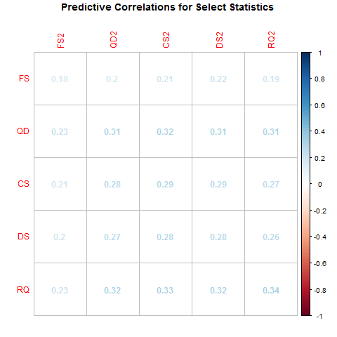
How well do these variables predict each other? This plot shows the correlation coefficients between our set of metrics in the first game and the second game. (Variables marked with 2 are the values from the second game played.)
In general, correct answers does predict the second-game results better than the other candidates, but it’s not too far from the other metrics that aren’t final score. (The margin of error on these correlations is roughly ± 0.05.) Still, this provides some firm evidence that final score isn’t a very good predictor, and that RQ might be the best of the ones here.
We can also use the data estimate how much noise each of the different elements add. If you assume that the player with the highest QD played the best match, then we can compare how often the highest QD player finishes with the best performance according to the other metrics. I find that the highest QD player finishes with the highest Coryat (i.e. including question values but no wagering) 83% of the time, the highest pre-Final Jeopardy! total (i.e. including question values and Daily Doubles) 80% of the time, and the highest overall score (i.e. she wins) 70% of the time. This means that including Final Jeopardy! increases the chances that the best performer doesn’t play another day 10% of the time, and weighting the questions at all increases the chances by 17%; both of those figures seem very high to me, and speak to how much randomness influences what we watch.
What about predicting future wins, though? What’s the best way to do that? To start with, I ran a series of logistic regressions (common models used to estimate probabilities for a binary variable like wins/losses) to see how well these variables predict loss. The following plots show the curve that estimates the probability of a player winning their second match, with bars showing the actual frequency of wins and losses. For the sake of brevity, let’s just show one score plot and one questions plot:
Unsurprisingly, the variable that was (in simplistic terms) the best predictor of peripherals also appears to be a much better predictor of future performance. We can see this not only by eyeballing the fit, but also simply by looking at the curves. The upward trend is much more pronounced in the later graphs, which here means that there’s enough meaningful variation to meaningfully peg some players as having 25% chances of winning and some as having 65% chances of winning. (For reference, 42% of players win their second games.) Final score, by contrast, puts almost all of the values in between 35% and 55%, suggesting that the difference between a player that got 20 questions right and one that got 25 right (43% and 55%) is comparable to the difference between a player that finished with $21,000 and one that finished with $40,000. Because $40,000 is in the top 1% of final scores in our dataset, while 25 questions right is only in the 85th percentile, this makes clear that score simply isn’t as predictive as questions answered. (For the technically inclined, the AIC of the models using raw questions are noticeably lower than those using various types of score. I left out the curves, but RQ is a little better than QD, noticeably better than DS and CS, and much better than FS.)
One of many issues with these regression models is that they impose a continuous structure on the data (i.e. they don’t allow for big jumps at a particular number of questions answered) and they omit interactions between variables (for instance, finishing with $25,000 might mean something very different depending on whether the player got 15 or 25 questions correct). To try to get around these issues, I also created a decision tree, which (in very crude terms) uses the data to build a flow-chart that predicts results.
Because of the way my software (the rpart package in R) fits the trees, it automatically throws out variables that don’t substantively improve the model, as opposed to the regressions above, which means it will tell us what the best predictors are. Here’s a picture of the decision tree that gets spit out. Note that all numbers in that plot are from the dataset used to build the model, not including the testing dataset; moreover, FALSE refers to losses and TRUE to wins.

This tells us that there’s some information in final score for distinguishing between contestants that answered a lot of questions correctly, but (as we suspected) questions answered is a lot more important. In fact, the model’s assessment of variable importance puts final score in dead last, behind correct answers, question difference, Coryat, and post-Double Jeopardy! score.
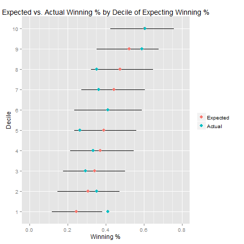
One last thing: now that we have our two models, which performs better? To test this, I did a couple of simple analyses using the portion of the data I had removed before building the models (roughly 330 games). For the logit model, I split the new data into 10 buckets based on the predicted probability that they would win their next game, then compared the actual winning percentage to the expected winning percentage for each bucket. I also calculated the confidence interval for the predictions because, with 33 games per bucket, there’s a lot of room for random variation to push the data around. (A technical note: the intervals come from simulations, because the probabilities within each bucket aren’t homogeneous.) A graphical representation of this is below, followed by the underlying numbers:
| Decile | Expected Win % | Lower Bound | Upper Bound | Actual Win % |
|---|---|---|---|---|
| 1 | 25 | 12 | 38 | 41 |
| 2 | 31 | 15 | 47 | 35 |
| 3 | 34 | 18 | 50 | 29 |
| 4 | 37 | 21 | 55 | 33 |
| 5 | 39 | 24 | 56 | 26 |
| 6 | 41 | 24 | 59 | 41 |
| 7 | 44 | 27 | 61 | 36 |
| 8 | 47 | 32 | 65 | 35 |
| 9 | 52 | 35 | 68 | 59 |
| 10 | 60 | 42 | 76 | 61 |
My takeaway from this (a very small sample!) is that the model does pretty well at very broadly assessing which players aren’t very likely to win and which aren’t, but the additional precision isn’t necessarily adding much, given how much overlap there is between the different deciles.
How about the tree model? The predictions from that one are pretty easy to summarize, because there’s only three separate predictions:
| Predicted Win % | Number of Matches | Number of Wins | Actual Winning % |
|---|---|---|---|
| 36 | 84 | 247 | 34 |
| 45 | 24 | 42 | 57 |
| 63 | 26 | 48 | 54 |
The lower probability (larger) bucket looks very good; the smaller buckets don’t look quite as nice (though they are within the 95% confidence intervals for the predictions). There is a bit of gain, though, if you remove the second decision from the tree, the one that uses final score to split the latter two buckets, the predicted winning percentage is 56%, which is (up to rounding) exactly what we get in the out-of-sample testing if we combine those two buckets. We shouldn’t ignore the discrepancies in those predictions with such a small out of sample test, but it does suggest that the model is picking up something pretty valuable.
Because of that and its greater simplicity, I’m inclined to pick the tree as the winner, but I don’t think it’s obviously superior, and you’re free to disagree. To further aid this evaluation, I intend to follow this post up in a few months to see how the models have performed with a few more months of predictions. In the meantime, keep an eye out for a small app that allows for some simple Jeopardy! metrics, including predicted next-game winning percentages and a means of comparing two performances.


