Tag Archives: baseball strategy

Do Platoon Splits Mess Up Projections?

Quick summary: I test the ZiPS and Marcel projection systems to see if their errors are larger for players with larger platoon splits. A first check says that they are not, though a more nuanced examination of the system remains to be conducted.


First, a couple housekeeping notes:

  • I will be giving a short talk at Saberseminar, which is a baseball research conference held in Boston in 10 days! If you’re there, you should go—I’ll be talking about how the strike zone changes depending on where and when games are played. Right now I’m scheduled for late Sunday afternoon.
  • Sorry for the lengthy gap between updates; work obligations plus some other commitments plus working on my talk have cut into my blogging time.

After the A’s went on their trading sprees last week at the trading deadline, there was much discussion about how they were going to intelligently deploy the rest of their roster to cover for the departure of Yoenis Cespedes. This is part of a larger pattern with the A’s as they continue to be very successful with their platoons and wringing lots of value out of their depth. Obviously, when people have tried to determine the impact of this trade, they’ve been relying on projections for each of the individual players involved.

What prompted my specific question is that Jonny Gomes is one of those helping to fill Cespedes’s shoes, and Gomes has very large platoon splits. (His career OPS is .874 against left-handed pitchers and .723 against righties.) The question is what proportion of Gomes’s plate appearances the projection systems assume will be against right handers; one might expect that if he is deployed more often against lefties than the system projects, he might beat the projections substantially.

Since Jonny Gomes in the second half of 2014 constitutes an extremely small sample, I decided to look at a bigger pool of players from the last few years and see if platoon splits correlated at all with a player beating (or missing) preseason projections. Specifically, I used the 2010, 2012, and 2013 ZiPS and Marcel projections (via the Baseball Projection Project, which doesn’t have 2011 ZiPS numbers).

A bit of background: ZiPS is the projection system developed by Dan Szymborski, and it’s one of the more widely used ones, if only because it’s available at FanGraphs and relatively easy to find there. Marcel is a very simple projection system developed by Tangotiger (it’s named after the monkey from Friends) that is sometimes used as a baseline for other projection systems. (More information on the two systems is available here.)

So, once I had the projections, I needed to come up with a measure of platoon tendencies. Since the available ZiPS projections only included one rate stat, batting average, I decided to use that as my measure of batting success. I computed platoon severity by taking the larger of a player’s BA against left-handers and BA against right-handers and dividing by the smaller of those two numbers. (As an example, Gomes’s BA against RHP is .222 and against LHP is .279, so his ratio is .279/.222 = 1.26.) My source for those data is FanGraphs.

I computed that severity for players with at least 500 PA against both left-handers and right-handers going into the season for which they were projected; for instance, for 2010 I would have used career data stopping at 2009. I then looked at their actual BA in the projected year, computed the deviation between that BA and the projected BA, and saw if there was any correlation between the deviation and the platoon ratio. (I actually used the absolute value of the deviation, so that magnitude was taken into account without worrying about direction.) Taking into account the availability of projections and requiring that players have at least 150 PA in the season where the deviation is measured, we have a sample size of 556 player seasons.

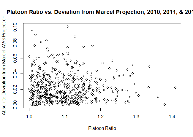
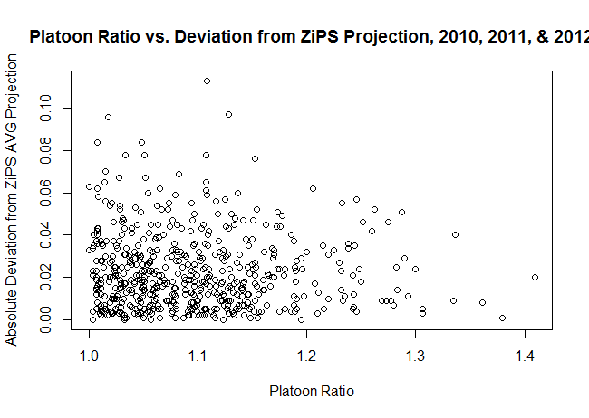
As it turns out, there isn’t any correlation between the two parameters. My hypothesis was that there’d be a positive correlation, but the correlation is -0.026 for Marcel projections and -0.047 for ZiPS projections, neither of which is practically or statistically significantly different from 0. The scatter plots for the two projection systems are below:

Marcel ZIPS

Now, there are a number of shortcomings to the approach I’ve taken:

  • It only looks at two projection systems; it’s possible this problem arises for other systems.
  • It only looks at batting average due to data availability issues, when wOBA, OPS, and wRC+ are better, less luck-dependent measures of offensive productivity.
  • Perhaps most substantially, we would expect the projection to be wrong if the player has a large platoon split and faces a different percentage of LHP/RHP during the season in question than he has in his career previously. I didn’t filter on that (I was having issues collecting those data in an efficient format), but I intend to come back to it.

So, if you’re looking for a takeaway, it’s that large platoon-split players on the whole do not appear to be poorly projected (for BA by ZiPS and Marcel), but it’s still possible that those with a large change in circumstances might differ from their projections.

More on Stealing with Runners on the Corners

A few people kicked around some suggestions about my last piece on Tom Tango’s blog, so I’m following up with a couple more pieces of analysis that will hopefully shed some light on things. As a quick refresher, I looked at steal attempts with runners on the corners and found that the success rate is much larger than the break even point, especially with two outs. My research suggests teams are too conservative, i.e. they should send the runners more. For more about methods and data, look at the prior piece.

One initial correction from Tango is that I was treating one class of events improperly; that’s since been corrected. (Specifically, two out events where one runner is out and the other scores are now counted as successes, not failures.) Another point made by Peter Jensen is that I should consider what happens when the runners are moving and contact is made; that’s going to require a bit more grinding with the data, but it’s now on my list of things to look at.

Next, there were some questions about how much of the success rate is due to having abnormally good or bad runners. Here are two plots showing all successes and failures by the stolen base percentages of the runners on first and third. The first is for all situations, the second for two out situations only.

Quick data note: to compute attempts and stolen base percentage, I used a centered three-year average, meaning that if an attempt took place in 2010 the SB% fed in would be the aggregate figure from 2009–2011. These charts only include situations where both runners have at least 20 attempts.

All Situations Two Outs

To simplify the charts a bit, I put the attempts into one of 36 buckets based on the SB% of the runners and then computed the success rates for those buckets; you can see the results in the tables below. The bucket boundaries are based on the distribution of SB%, so the 17th, 33rd, 50th, 67th, and 83rd percentiles. Sample sizes are roughly 55 for two outs (minimum 40) and 100-110 overall (minimum 73).

Outcomes of 1st/3rd Steal Attempts by SB% of Runners on Base, All Situations
Third Base SB% Bucket
1st Base SB% Bucket 27.3%—61.4% 61.4%—68% 68%—72.5% 72.5%—75.8% 75.8%—80% 80%—95.5%
33.3%—64.9% 72.6 79.1 83.0 77.1 83.3 81.0
64.9%—70.6% 80.3 85.6 80.8 88.2 86.8 87.1
70.6%—74.4% 86.4 84.0 83.7 87.3 85.3 86.3
74.4%—77.6% 85.6 85.9 91.4 86.4 92.7 89.8
77.6%—81.2% 91.3 90.5 83.3 90.3 95.2 90.6
81.2%—96.2% 90.8 84.9 89.4 90.8 93.6 89.1
Outcomes of 1st/3rd Steal Attempts by SB% of Runners on Base, Two Outs
Third Base SB% Bucket
1st Base SB% Bucket 27.3%—60.9% 60.9%—67.6% 67.6%—72.1% 72.1%—75.5% 75.5%—80% 80%—93.9%
35%—64.1% 86.9 89.2 87.7 84.6 92.5 89.4
64.1%—70.1% 89.6 93.2 89.1 89.1 87.8 91.5
70.1%—74% 92.7 85.7 91.7 96.6 93.3 91.5
74%—77.5% 94.1 93.3 92.9 94.6 100.0 93.5
77.5%—81.1% 95.0 87.7 94.4 93.5 98.2 97.1
81.1%—95.5% 95.8 89.3 90.7 91.2 95.7 95.5

As you can see, even with noticeably below-average runners at both bases (average SB% is 70%), teams are successful so often that they should be trying it more often—all buckets but one in the two tables have a success rate above break-even. (BE rates are 75.5% overall and 69% for 2 outs.) There’s still a little bit of selection bias, which is pertinent, though I don’t think it accounts for most of the effect—see the note below. However, the fact that every single bucket comes in well above the break-even rate suggests to me that even accounting for the selection bias, this is still an area where managers should be more aggressive. At the very least, it seems that if there are two average base thieves on and two out, the runner on first should be going much more frequently than the current sub-10% attempt rate.

Note: One important thing to consider is that putting the attempts minimum in place noticeably increases the success rate—from 83% to 86% overall, and from 90% to 92% for two out situations. (The explanation for that is that really slow players don’t necessarily have poor SB%, they just have next to no stolen base attempts, so they are falling out of the data.) However, if you stick to the attempts where one or both runners have few attempts, the success rate only drops about 2 percentage points, which is still pretty far above the breakeven point overall and with two outs.

Stealing an Advantage from First and Third

(Note: Inspired by this post from Jeff Fogle, I decided to change the format up a bit for this post, specifically by putting an abstract at the beginning. We’ll see if it sticks.) This post looks at baserunning strategy with runners on first and third, specifically having to do with when to have the runner on first attempt to steal. My research suggests that teams may be currently employing this strategy in a non-optimal manner. While they start the runner as often as they should with one out, they should probably run more frequently with zero and two outs with runners on first and third than they currently. The gain from this aggressiveness is likely to be small, on the order of a few runs a season. Read on if you want to know how I came to this conclusion.


Back when I used to play a lot of the Triple Play series, I loved calling for a steal with runners on first and third. It seemed like you could basically always get the runner to second, and if he drew a throw then the runner on third would score. It’s one of those fun plays that introduced a bit of chaos and works disproportionately frequently in videogames. Is that last statement true? Well, I don’t know how frequently it worked in Triple Play 99, but I can look at how frequently it works in the majors. And it appears to work pretty darn frequently.*

* I haven’t found any prior research directly addressing this, but this old post by current Pirates analytics honcho Dan Fox obliquely touches on it. I’m pretty confident that his conclusions are different because he’s omitting an important case and focusing directly on double steals, and not because either one of us is wrong.

The data I looked at were Retrosheet play-by-play data from 1989–2013, looking at events classified as caught stealing, stolen bases, balks, and pickoffs with runners at first and third. I then removed caught stealing and steals where the runner on first remained on first at the end of the play, leaving 8500 events or so. That selection of events is similar to what Tom Tango et al. do in The Book and control for the secondary effects of base stealing, but I added the restriction about the runner on first to remove failed squeezes, straight steals of home, and other things that aren’t related to what we’re looking at. This isn’t going to perfectly capture the events we want, but modulo the limitations of play-by-play data it’s the best cut of the data I could think of. (It’s missing two big things: the impact of running on batter performance and what happens when the runners go and the ball is put in play. The first would take a lot of digging to guess at, and the second is impossible to get from my data, so I’m going to postulate they have a small effect and leave it at that.)

So, let’s say we define an outcome to be successful if it leads to an increased run expectancy. (Run expectancy is computed empirically and is essentially the average number of runs scored in the remainder of an inning given where the baserunners are and how many outs there are.) In this particular scenario, increased run expectancy is equivalent to an outcome where both runners are safe, which occurs 82.7% of the time. For reference, league average stolen base percentage over this period is 69.9% (via the Lahman database), so that’s a sizeable difference in success rates (though the latter figure doesn’t account for pickoffs, errors, and balks). (For what it’s worth, both of those numbers have gone up between 4 and 6 percentage points in the last five years.)

How much of that is due to self-selection and how much is intrinsic to the situation itself? In other words, is this just a function of teams picking their spots? It’s hard to check every aspect of this (catcher, pitcher, leverage, etc.), so I chose to focus on one, which is the stolen base percentage of the runner on first. I used a three year centered average for the players (meaning if the attempt took place in 1999, I used their combined stolen base figures from 1998–2000), and it turns out that on aggregate runners on first during 1st and 3rd steal attempts are about one percentage point better than the league average. That’s noticeable and not meaningless, but given how large the gap in success rate is the increased runner quality can’t explain the whole thing.

Now, what if we want to look at the outcomes more granularly? The results are in the table below. (The zeros are actually zero, not rounded.)

Outcomes of 1st/3rd Steal Attempts (Percentage)
Runner on First’s Destination
Runner on Third’s Destination Out 1st Base 2nd Base 3rd Base Run
Out 0.20 0.97 2.78 0.23 0.00
3rd Base 12.06 0.00 69.89 0.00 0.00
Run 1.07 0.36 9.31 2.98 0.15

This doesn’t directly address run expectancy, which is what we need if we’re going to actually determine the utility of this tactic. If you take into account the number of outs, balks, and pickoffs and combine the historical probabilities seen in that table with Baseball Prospectus’s 2013 run expectancy tables*, you get that each attempt is worth about 0.07 runs. (Restricting to the last five years, it’s 0.09.) That’s something, but it’s not much—you’d need to have 144 attempts a year at that success rate to get an extra win, which isn’t likely to happen given that there only about 200 1st and 3rd situations per team per year according to my quick count. Overall, the data suggest the break even success rate is on the order of 76%.**

* I used 2013 tables a) to simplify things and b) to make these historical rates more directly applicable to the current run environment.

** That’s computed using a slight simplification—I averaged the run values of all successful and unsuccessful outcomes separately, then calculated the break even point for that constructed binary process. Take the exact values with a grain of salt given the noise in the low-probability, high-impact outcomes (e.g. both runners score, both runners are out).

There’s a wrinkle to this, though, which is that the stakes and decision making processes are going to be different with zero, one, or two outs.  In the past, the expected value of running with first and third is actually negative with one out (-0.04), whereas the EV for running with two outs is about twice the overall figure. (The one out EV is almost exactly 0 over the last five years, but I don’t want to draw too many conclusions from that if it’s a blip and not a structural change.) That’s a big difference, probably driven by the fact that the penalty for taking the out is substantially less with two outs, and it’s not due to a small sample—two out attempts make up more than half the data. (For what it’s worth, there aren’t substantive discrepancies in the SB% of the runners involved between the different out states.) The table below breaks it down more clearly:

Success and Break Even Rates for 1st/3rd Steal Attempts by Outs
Number of Outs Historical Success Percentage Break Even Percentage
0 81.64 74.61
1 73.65 78.00
2 88.71 69.03
Overall 82.69 75.52

That third row is where I think there’s a lot of hay to be made, and I think the table makes a pretty clear case: managers should be quite aggressive about starting the runner if there’s a first and third with two outs, even if there’s a slightly below average runner at first. They should probably be a bit more aggressive than they currently are with no outs, and more conservative with one out.

There’s also plenty of room for this to happen more frequently; with two outs, the steal attempt rate last year was about 6.6% (it’s 5% with one out, and 4% with no outs). The number of possible attempts per team last year was roughly 200, split 100/70/30 between 2/1/0 outs, so there are some reasonable gains to be made. It’s not going to make a gigantic impact, but if a team sends the runner twice as often as they have been with two outs (about one extra time per 25 games), that’s a run gained, which is small but still an edge worth taking. Maybe my impulses when playing Triple Play had something to them after all.