Wear Down, Chicago Bears?

I watched the NFC Championship game the weekend before last via a moderately sketchy British stream. It used the Joe Buck/Troy Aikman feed, but whenever that went to commercials they had their own British commentary team whose level of insight, I think it’s fair to say, was probably a notch below what you’d get if you picked three thoughtful-looking guys at random out of an American sports bar. (To be fair, that’s arguably true of most of the American NFL studio crews as well.)

When discussing Marshawn Lynch, one of them brought out the old chestnut that big running backs wear down the defense and thus are likely to get big chunks of yardage toward the end of games, citing Jerome Bettis as an example of this. This is accepted as conventional wisdom when discussing football strategy, but I’ve never actually seen proof of this one way or another, and I couldn’t find any analysis of this before typing up this post.

The hypothesis I want to examine is that bigger running backs are more successful late in games than smaller running backs. All of those terms are tricky to define, so here’s what I’m going with:

  • Bigger running backs are determined by weight, BMI, or both. I’m using Pro Football Reference data for this, which has some limitations in that it’s not dynamic, but I haven’t heard of any source that has any dynamic information on player size.
  • Late in games is the simplest thing to define: fourth quarter and overtime.
  • More successful is going to be measured in terms of yards per carry. This is going to be compared to the YPC in the first three quarters to account for the baseline differences between big and small backs. The correlation between BMI and YPC is -0.29, which is highly significant (p = 0.0001). The low R squared (about 0.1) says that BMI explains about 10% of variation in YPC, which isn’t great but does say that there’s a meaningful connection. There’s a plot below of BMI vs. YPC with the trend line added; it seems like close to a monotonic effect to me, meaning that getting bigger is on average going to hurt YPC. (Assuming, of course, that the player is big enough to actually be an NFL back.)

BMI & YPC

My data set consisted of career-level data split into 4th quarter/OT and 1st-3rd quarters, which I subset to only include carries occurring while the game was within 14 points (a cut popular with writers like Bill Barnwell—see about halfway down this post, for example) to attempt to remove huge blowouts, which may affect data integrity. My timeframe was 1999 to the present, which is when PFR has play-by-play data in its database. I then subset the list of running backs to only those with at least 50 carries in the first three quarters and in the fourth quarter and overtime (166 in all). (I looked at different carry cutoffs, and they don’t change any of my conclusions.)

Before I dive into my conclusions, I want to preemptively bring up a big issue with this, which is that it’s only on aggregate level data. This involves pairing up data from different games or even different years, which raises two problems immediately. The first is that we’re not directly testing the hypothesis; I think it is closer in spirit to interpret as “if a big running back gets lots of carries early on, his/his team’s YPC will increase in the fourth quarter,” which can only be looked at with game level data. I’m not entirely sure what metrics to look at, as there are a lot of confounds, but it’s going in the bucket of ideas for research.

The second is that, beyond having to look at this potentially effect indirectly, we might actually have biases altering the perceived effect, as when a player runs ineffectively in the first part of the game, he will probably get fewer carries at the end—partially because he is probably running against a good defense, and partially because his team is likely to be behind and thus passing more. This means that it’s likely that more of the fourth quarter carries come when a runner is having a good day, possibly biasing our data.

Finally, it’s possible that the way that big running backs wear the defense down is that they soften it up so that other running backs do better in the fourth quarter. This is going to be impossible to detect with aggregate data, and if this effect is actually present it will bias against finding a result using aggregate data, as it will be a lurking variable inflating the fourth quarter totals for smaller running backs.

Now, I’m not sure that either of these issues will necessarily ruin any results I get with the aggregate data, but they are caveats to be mentioned. I am planning on redoing some of this analysis with play-by-play level data, but those data are rather messy and I’m a little scared of small sample sizes that come with looking at one quarter at a time, so I think presenting results using aggregated data still adds something to the conversation.

Enough equivocating, let’s get to some numbers. Below is a plot of fourth quarter YPC versus early game YPC; the line is the identity, meaning that points above the line are better in the fourth. The unweighted mean of the difference (Q4 YPC – Q1–3 YPC) is -0.14, with the median equal to -0.15, so by the regular measures a typical running back is less effective in the 4th quarter (on aggregate in moderately close games). (A paired t-test shows this difference is significant, with p < 0.01.)

Q1-3 & Q4

A couple of individual observations jump out here, and if you’re curious, here’s who they are:

  • The guy in the top right, who’s very consistent and very good? Jamaal Charles. His YPC increases by about 0.01 yards in the fourth quarter, the second smallest number in the data (Chester Taylor has a drop of about 0.001 yards).
  • The outlier in the bottom right, meaning a major dropoff, is Darren Sproles, who has the highest early game YPC of any back in the sample.
  • The outlier in the top center with a major increase is Jerious Norwood.
  • The back on the left with the lowest early game YPC in our sample is Mike Cloud, whom I had never heard of. He’s the only guy below 3 YPC for the first three quarters.

A simple linear model gives us a best fit line of (Predicted Q4 YPC) = 1.78 + 0.54 * (Prior Quarters YPC), with an R squared of 0.12. That’s less predictive than I thought it would be, which suggests that there’s a lot of chance in these data and/or there is a lurking factor explaining the divergence. (It’s also possible this isn’t actually a linear effect.)

However, that lurking variable doesn’t appear to be running back size. Below is a plot showing running back BMI vs. (Q4 YPC – Q1–3 YPC); there doesn’t seem to be a real relationship. The plot below it shows difference and fourth quarter carries (the horizontal line is the average value of -0.13), which somewhat suggests that this is an effect that decreases with sample size increasing, though these data are non-normal, so it’s not an easy thing to immediately assess.

BMI & DiffCarries & Diff

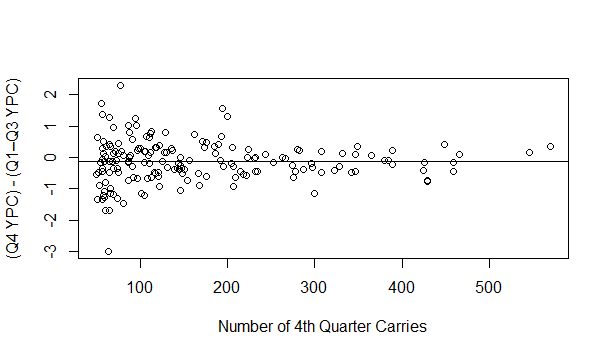
That intuition is borne out if we look at the correlation between the two, with an estimate of 0.02 that is not close to significant (p = 0.78). Using weight and height instead of BMI give us larger apparent effects, but they’re still not significant (r = 0.08 with p = 0.29 for weight, r = 0.10 with p = 0.21 for height). Throwing these variables in the regression to predict Q4 YPC based on previous YPC also doesn’t have any effect that’s close to significant, though I don’t think much of that because I don’t think much of that model to begin with.

Our talking head, though, mentioned Lynch and Bettis by name. Do we see anything for them? Unsurprisingly, we don’t—Bettis has a net improvement of 0.35 YPC, with Lynch actually falling off by 0.46 YPC, though both of these are within one standard deviation of the average effect, so they don’t really mean much.

On a more general scale, it doesn’t seem like a change in YPC in the fourth quarter can be attributed to running back size. My hunch is that this is accurate, and that “big running backs make it easier to run later in the game” is one of those things that people repeat because it sounds reasonable. However, given all of the data issues I outlined earlier, I can’t conclude that with any confidence, and all we can say for sure is that it doesn’t show up in an obvious manner (though at some point I’d love to pick at the play by play data). At the very least, though, I think that’s reason for skepticism next time some ex-jock on TV mentions this.

Do Low Stakes Hockey Games Go To Overtime More Often?

Sean McIndoe wrote another piece this week about NHL overtime and the Bettman point (the 3rd point awarded for a game that is tied at the end of regulation—depending on your preferred interpretation, it’s either the point for the loser or the second point for the winner), and it raises some interesting questions. I agree with one part of his conclusion (the loser point is silly), but not with his proposed solution—I think a 10 or 15 minute overtime followed by a tie is ideal, and would rather get rid of the shootout altogether. (There may be a post in the future about different systems and their advantages/disadvantages.)

At one point, McIndoe is discussing how the Bettman point affects game dynamics, namely that it makes teams more likely to play for a tie:

So that’s exactly what teams have learned to do. From 1983-84 until the 1998-99 season, 18.4 percent of games went to overtime. Since the loser point was introduced, that number has up to 23.5 percent. 11 That’s far too big a jump to be a coincidence. More likely, it’s the result of an intentional, leaguewide strategy: Whenever possible, make sure the game gets to overtime.

In fact, if history holds, this is the time of year when we’ll start to see even more three-point games. After all, the more important standings become, the more likely teams will be to try to maximize the number of points available. And sure enough, this has been the third straight season in which three-point games have increased every month. In each of the last three full seasons, three-point games have mysteriously peaked in March.

So, McIndoe is arguing that teams are effectively playing for overtime later in the season because teams feel a more acute need for points. If you’re curious, based on my analysis this trend he cites is statistically significant, looking at a simple correlation of fraction of games ending in ties with the relative month of the season. If one assumes the effect is linear, each month the season goes on, a game becomes 0.5 percentage points more likely to go to overtime. (As an aside, I suspect a lot of the year-over-year trend is explained by a decrease in scoring over time, but that’s also a topic for another post.)

I’m somewhat unconvinced of this, given that later in the year there are teams who are tanking for draft position (would rather just take the loss) and teams in playoff contention want to deprive rivals of the extra point. (Moreover, teams may also become more sensitive to playoff tiebreakers, the first one of which is regulation and overtime wins.) If I had to guess, I would imagine that the increase in ties is due to sloppy play due to injuries and fatigue, but that’s something I’d like to investigate and hopefully will in the future.

Still, McIndoe’s idea is interesting, as it (along with his discussion of standings inflation, in which injecting more points into the standings makes everyone likelier to keep their jobs) suggests to me that there could be some element of collusion in hockey play, in that under some circumstances both teams will strategically maximize the likelihood of a game going to overtime. He believes that both teams will want the points in a playoff race. If this quasi-collusive mechanism is actually in place, where else might we see it?

My idea to test this is to look at interconference matchups. Why? This will hopefully be clear from looking at the considerations when a team wins in regulation instead of OT or a shootout:

  1. The other team gets one point instead of zero. Because the two teams are in different conferences, this has no effect on whether either team makes the playoffs, or their seeding in their own conference. The only way it matters is if a team suspects it would want home ice advantage in a matchup against the team it is playing…in the Stanley Cup Finals, which is so unlikely that a) it won’t play into a team’s plans and b) even if it did, would affect very few games. So, from this perspective there’s no incentive to win a 2 point game rather than a 3 point game.
  2. Regulation and overtime wins are a tiebreaker. However, points are much more important than the tiebreaker, so a decision that increases the probability of getting points will presumably dominate considerations about needing the regulation win. Between 1 and 2, we suspect that one team benefits when an interconference game goes to overtime, and the other is not hurt by the result.
  3. The two teams could be competing for draft position. If both teams are playing to lose, we would suspect this would be similar to a scenario in which both teams are playing to win, though that’s a supposition I can test some other time.

So, it seems to me that, if there is this incentive issue, we might see it in interconference games. So our hypothesis is that interconference games result in more three point games than intraconference games.

Using data from Hockey Reference, I looked at the results of every regular season game since 1999, when overtime losses began getting teams a point, counting the number of games that went to overtime. (During the time they were possible, I included ties in this category.) I also looked at the stats restricted to games since 2005, when ties were abolished, and I didn’t see any meaningful differences in the results.

As it turns out, 24.0% of interconference games have gone to OT since losers started getting a point, compared with…23.3% of intraconference games. That difference isn’t statistically significant (p = 0.44); I haven’t done power calculations, but since our sample of interconference games has N > 3000, I’m not too worried about power. Moreover, given the point estimate (raw difference) of 0.7%, we are looking at such a small effect even if it were significant that I wouldn’t put much stock in it. (The corresponding figures for the shootout era are 24.6% and 23.1%, with a p-value of 0.22, so still not significant.)

My idea was that we would see more overtime games, not more shootout games, as it’s unclear how the incentives align for teams to prefer the shootout, but I looked at the numbers anyway. Since 2005, 14.2% of interconference games have gone to the skills competition, compared to 13.0% of intraconference games. Not to repeat myself too much, but that’s still not significant (p = 0.23). Finally, even if we look at shootouts as a fraction of games that do go to overtime, we see no substantive difference—57.6% for interconference games, 56.3% for intraconference games, p = 0.69.

So, what do we conclude from all of these null results? Well, not much, at least directly—such is the problem with null results, especially when we are testing an inference from another hypothesis. It suggests that NHL teams aren’t repeatedly and blatantly colluding to maximize points, and it also suggests that if you watch an interconference game you’ll get to see the players trying just as hard, so that’s good, if neither novel nor what we set out to examine. More to the point, my read is that this does throw some doubt on McIndoe’s claims about a deliberate increase in ties over the course of the season, as it shows that in another circumstance where teams have an incentive to play for a tie, there’s no evidence that they are doing so. However, I’d like to do several different analyses that ideally address this question more directly before stating that firmly.

Or, to borrow the words of a statistician I’ve worked with: “We don’t actually know anything, but we’ve tried to quantify all the stuff we don’t know.”

Casey Stengel: Hyperbole Proof

Today, as an aside in Jayson Stark’s column about replay:

“I said, ‘Just look at this as something you’ve never had before,'” Torre said. “And use it as a strategy. … And the fact that you only have two [challenges], even if you’re right — it’s like having a pinch hitter.’ Tony and I have talked about it. It’s like, ‘When are you going to use this guy?'”

But here’s the problem with that analogy: No manager would ever burn his best pinch hitter in the first inning, right? Even if the bases were loaded, and Clayton Kershaw was pitching, and you might never have a chance this good again.

No manager would do that? In the same way that no manager would ramble on and on when speaking before the Senate Antitrust Subcommittee. That is to say, Casey Stengel would do it. Baseball Reference doesn’t have the best interface for this, and it would have taken me a while to dig this out of Retrosheet, but Google led me to this managerial-themed quiz, which led me in turn to the Yankees-Tigers game from June 10, 1954. Casey pinch hit in the first inning—twice! I’m sure there are more examples of this, but this was the first one I could find.

Casey Stengel: great manager, and apparently immune to rhetorical questions.

The Joy of the Internet

One of the things I love about the Internet is that you can use the vast amounts of information to research really minor trivia from pop culture and sports. In particular, there’s something I find charming about the ability to identify exact sporting (or other) moments from various works of fiction—for instance, Ice Cube’s good day and the game Ferris Bueller attended.

I bring this up because I finally started watching The Wire (it’s real good, you should watch it too) and, in a scene from the Season 3 premiere, McNulty and Bunk go to a baseball game with their sons. This would’ve piqued my interest regardless, because it’s baseball and because it’s Camden Yards, but it’s also a White Sox game, and since the episode came out a year before the White Sox won the series, it features some players that I have fond memories of.

So, what game is it? As it turns out, we only need information about the players shown onscreen to make this determination. For starters, Carlos Lee bats for the Sox:

Carlos Lee

This means the game can’t take place any later than 2004, as Lee was traded after the season. (Somewhat obvious, given that the episode was released in 2004, but hey, I’m trying to do this from in-universe clues only.) Who is that who’s about to go after the pop up?

Javy Lopez

Pretty clearly Javy Lopez:

Lopez Actual

Lopez didn’t play for the O’s until 2004, so we have a year locked down. Now, who threw the pitch?

Sidney Ponson

Sidney Ponson, everyone’s favorite overweight Aruban pitcher! Ponson only pitched in one O’s-Sox game at Camden Yards in 2004, so that’s our winner: May 5, 2004. A White Sox winner, with Juan Uribe having a big triple, Billy Koch almost blowing the save, and Shingo Takatsu—Mr. Zero!—getting the W.

One quick last note—a quick Google reveals that I’m far from the first person to identify this scene and post about it online, but I figured it’d be good for a light post and hey, I looked it up myself before I did any Googling.

A Reason Bill Simmons is Bad At Gambling

For those unaware, Bill Simmons, aka the Sports Guy, is the editor-in-chief of Grantland, ESPN’s more literary (or perhaps intelligent, if you prefer) offshoot. He’s hired a lot of really excellent  writers (Jonah Keri and Zach Lowe, just to name two), but he continues to publish long, rambling football columns with limited empirical support. I find this somewhat frustrating given that the chief Grantland NFL writer, Bill Barnwell, is probably the most prominent data-oriented football writer around, but you take the good with the bad.

Simmons writes a column with NFL picks each week during the season, and has a pretty so-so track record for picking against the spread, as detailed in the first footnote to this article here. Simmons has also written a number of lengthy columns attempting to construct a system for gambling on the playoffs, and hasn’t done too great in this regard either. I’ve been meaning to mine some of these for a post for a while now, and since he’s written two such posts this year already (wild card and divisional round), I figured the time was right to look at some of his assertions.

The one I keyed on was this one, from two weeks ago:

SUGGESTION NO. 6: “Before you pick a team, just make sure Marty Schottenheimer, Herm Edwards, Wade Phillips, Norv Turner, Andy Reid, Anyone Named Mike, Anyone Described As Andy Reid’s Pupil and Anyone With the Last Name Mora” Isn’t Coaching Them.

I made this tweak in 2010 and feel good about it — especially when the “Anyone Named Mike” rule miraculously covers the Always Shaky Mike McCarthy and Mike “You Know What?” McCoy (both involved this weekend!) as well as Mike Smith, Mike “The Sideline Karma Gods Put A Curse On Me” Tomlin, Mike Munchak and the recently fired Mike Shanahan. We’re also covered if Mike Shula, Mike Martz, Mike Mularkey, Mike Tice or Mike Sherman ever make comebacks. I’m not saying you bet against the Mikes — just be psychotically careful with them. As for Andy Reid … we’ll get to him in a second.

That was written before the playoffs—after Round 1, he said he thinks he might make it an ironclad rule (with “Reid’s name…[in] 18-point font,” no less).

Now, these coaches certainly have a reputation for performing poorly under pressure and making poor decisions regarding timeouts, challenges, etc., but do they actually perform worse against the spread? I set out to find this out, using the always-helpful pro-football-reference database of historical gambling lines to get historical ATS performance for each coach he mentions. (One caveat here: the data only list closing lines, so I can’t evaluate how the coaches did compared to opening spreads, nor how much the line moved, which could in theory be useful to evaluate these ideas as well.) The table below lists the results:

Playoff Performance Against the Spread by Select Coaches
Coach Win Loss Named By Simmons Notes
Childress 2 1 No Andy Reid Coaching Tree
Ditka 6 6 No Named Mike
Edwards 3 3 Yes
Frazier 0 1 No Andy Reid Coaching Tree
Holmgren 13 9 No Named Mike
John Harbaugh 9 4 No Andy Reid Coaching Tree
Martz 2 5 Yes Named Mike
McCarthy 6 4 Yes Named Mike
Mora Jr. 1 1 Yes
Mora Sr. 0 6 Yes
Phillips 1 5 Yes
Reid 11 8 Yes
Schotteinheimer 4 13 Yes
Shanahan 7 6 Yes Named Mike
Sherman 2 4 Yes Named Mike
Smith 1 4 Yes Named Mike
Tice 1 1 Yes Named Mike
Tomlin 5 3 Yes Named Mike
Turner 6 2 Yes

A few notes: first, I’ve omitted pushes from these numbers, as PFR only lists two (both for Mike Holmgren). Second, the Reid coaching tree includes the three NFL coaches who served as assistants under Reid who coached an NFL playoff game before this postseason. Whether or not you think of them as Reid’s pupils is subjective, but it seems to me that doing it any other way is going to either turn into circular reasoning or cherry-picking. Third, my list of coaches named Mike is all NFL coaches referred to as Mike by Wikipedia who coached at least one playoff game, with the exception of Mike Holovak, who coached in the AFL in the 1960s and who thus a) seems old enough not to be relevant to this heuristic and b) is old enough that there isn’t point spread data for his playoff game on PFR, anyhow.

So, obviously some of these guys have had some poor performances against the spread: standouts include Jim Mora, Sr. at 0-6 and Marty Schottenheimer at 4-13, though the latter isn’t actually statistically significantly different from a .500 winning percentage (p = 0.052). More surprising, given Simmons’s emphasis on him, is the fact that Reid is actually over .500 lifetime in the playoffs against the spread. (That’s the point estimate, anyway; it’s not statistically significantly better, however.) This seems to me to be something you would want to check before making it part of your gambling platform, but that disconnect probably explains both why I don’t gamble on football and why Simmons seems to be poor at it. (Not that his rule has necessarily done him wrong, but drawing big conclusions on limited or contradictory evidence seems like a good way to lose a lot of money.)

Are there any broader trends we can pick up? Looking at Simmons’s suggestion, I can think of a few different sets we might want to look at:

  1. Every coach he lists by name.
  2. Every coach he lists by name, plus the Reid coaching tree.
  3. Every coach he lists by name, plus the unnamed Mikes.
  4. Every coach he lists by name, plus the Reid coaching tree and the unnamed Mikes.

A table with those results is below.

Combined Against the Spread Results for Different Groups of Coaches Cited By Simmons
Set of Coaches Number of Coaches in Set Wins Losses Winning Percentage p-Value
Named 14 50 65 43.48 0.19
Named + Reid 17 61 71 46.21 0.43
Named + Mikes 16 69 80 46.31 0.41
All 19 80 86 48.19 0.70

As a refresher, the p-value is the probability that we would observe a result as or more extreme as the observed result if there were no true effect, i.e. the selected coaches are actually average against the spread. (Here’s the Wikipedia article.) Since none of these are significant even at the 0.1 level (which is generally the lowest barrier to treating a result as meaningful), we wouldn’t conclude that any of Simmons’s postulated sets are actually worse than average ATS in the playoffs. It is true that these groups have done worse than average, but the margins aren’t huge and the samples are small, so without a lot more evidence I’m inclined to think that there isn’t any effect here. These coaches might not have been very successful in the playoffs, but any effect seems to be built into the lines.

Did Simmons actually follow his own suggestion this postseason? Well, he picked against Reid, for Mike McCoy (first postseason game), and against Mike McCarthy in the wild card round, going 1-0-2, with the one win being in the game he went against his own rule. For the divisional round, he’s gone against Ron Rivera (first postseason game, in the Reid coaching tree) and against Mike McCoy, sticking with his metric. Both of those games are today, so as I type we don’t know the results, but whatever they are, I bet they have next to nothing to do with Rivera’s relationship to Reid or McCoy’s given name.

Is a Goalie’s Shootout Performance Meaningful?

One of the bizarre things about hockey is that the current standings system gives teams extra points for winning shootouts, which is something almost entirely orthogonal to, you know, actually being a good hockey team. I can’t think of another comparable situation in sports. Penalty shootouts in soccer are sort of similar, but they only apply in knockout situations, whereas shootouts in hockey only occur in the regular season.

Is this stupid? Yes, and a quick Google will bring up a fair amount of others’ justified ire about shootouts and their effect on standings. I think the best solution is something along the lines of a 10 minute overtime (loser gets no points), and if it’s tied after 70 then it stays a tie. Since North Americans hate ties, though, I can’t imagine that change being made, though.

What makes it so interesting to me, though, is that it opens up a new set of metrics for evaluating both skaters and goalies. Skaters, even fourth liners, can contribute a very large amount through succeeding in the shootout, given that it’s approximately six events and someone gets an extra point out of it. Measuring shooting and save percentage in shootouts is pretty easy, and there’s very little or no adjustment needed to see how good a particular player is.

The first question we’d like to address is: is it even reasonable to say that certain players are consistently better or worse in shootouts, or is this something that’s fundamentally random (as overall shooting percentage is generally thought to be in hockey)? We’ll start this from the goalie side of things; in a later post, I’ll move onto the skaters.

Since the shootout was introduced after the 2004-05 lockout, goalies have saved 67.1% of all shot attempts. (Some data notes: I thought about including penalty shots as well, but those are likely to have a much lower success rate and don’t occur all that frequently, so I’ve omitted them. All data come from NHL or ESPN and are current as of the end of the 2012-13 season. UPDATE: I thought I remembered confirming that penalty shots have a lower success rate, but some investigations reveal that they are pretty comparable to shootout attempts, which is a little interesting. Just goes to show what happens when you assume things.)

Assessing randomness here is pretty tricky; the goalie in my data who has seen the most shootout attempts is Henrik Lundqvist, with 287. That might seem like a lot, but he’s seen a little over 14,000 shots in open play, which is a bit less than 50 times as many. This means that things are likely to be intensely volatile, at least from season to season. This intuition is correct, as looking at the year-over-year correlation between shootout save percentages (with each year required to have at least 20 attempts against) gets us a correlation of practically 0 (-0.02, with a wide confidence interval).

Given that there are only 73 pairs of seasons in that sample, and the threshold is only 20 attempts, we are talking about a very low power test, though. However, there’s a different, and arguably better, way to do this: look at how many extreme values we see in the distribution. This is tricky when modelling certain things, as you have to have a strong sense of what the theoretical distribution really is. Thankfully, given that there are only two outcomes here, if there is really no goaltender effect, we would expect to see a nice neat binomial distribution (analogous to a weighted coin). (There’s one source of heterogeneity I know I’m omitting, and that’s shooter quality. I can’t be certain that doesn’t contaminate these data, but I see no reason it would introduce bias rather than just error.)

We can test this by noting that if all goalies are equally good at shootouts, they should all have a true save percentage of 67% (the league rate). We can then calculate the probability that a given goalie would have the number of saves they do if they performed league average, and if we get lots of extreme values we can sense that there is something non-random lurking.

There have been 60 goalies with at least 50 shootout attempts against, and 14 of them have had results that would fall in the most extreme 5% relative to the mean if they in fact performed at a league average rate. (This is true even if we attempt to account for survivorship bias by only looking at the average rate for goalies that have that many attempts.) The probability that at least that many extreme values occur in a sample of this size is on the order of 1 in 5 million. (The conclusion doesn’t change if you look at other cutoffs for extreme values.) To me, this indicates that the lack of year over year correlation is largely a function of the lack of power and there is indeed something going on here.

The tables below shows some figures for the best and worst shootout goalies. Goalies are marked as significant if the probability they would get that percentage if they were actually league average is less than 5%.

Player Attempts Saves Percentage Significant
1 Semyon Varlamov, G 71 55 77.46 Yes
2 Brent Johnson, G 55 42 76.36 Yes
3 Henrik Lundqvist, G 287 219 76.31 Yes
4 Marc-Andre Fleury, G 177 135 76.27 Yes
5 Antti Niemi, G 133 101 75.94 Yes
6 Mathieu Garon, G 109 82 75.23 Yes
7 Johan Hedberg, G 129 97 75.19 Yes
8 Manny Fernandez, G 63 46 73.02 No
9 Rick DiPietro, G 126 92 73.02 No
10 Josh Harding, G 55 40 72.73 No
Player Attempts Saves Percentage Significant
1 Vesa Toskala, G 63 33 52.38 Yes
2 Ty Conklin, G 55 29 52.73 Yes
3 Martin Biron, G 76 41 53.95 Yes
4 Jason LaBarbera, G 77 43 55.84 Yes
5 Curtis Sanford, G 50 28 56.00 No
6 Niklas Backstrom, G 176 99 56.25 Yes
7 Jean-Sebastien Giguere, G 155 93 60.00 Yes
8 Miikka Kiprusoff, G 185 112 60.54 Yes
9 Sergei Bobrovsky, G 51 31 60.78 No
10 Chris Osgood, G 67 41 61.19 No

So, some goalies are actually good (or bad) at shootouts. This might seem obvious, but it’s a good thing to clear up. Another question: are these the same goalies that are better at all times? Not really, as it turns out; the correlation between raw save percentage (my source didn’t have even strength save percentage, unfortunately) and shootout save percentage is about 0.27, which is statistically significant but only somewhat practically significant—using the R squared from regressing one on the other, we figure that goalie save percentage only predicts about 5% of the variation in shootout save percentage.

You may be asking: what does all of this mean? Well, it means it might not be fruitless to attempt to incorporate shooutout prowess into our estimates of goalie worth. After all, loser points are a thing, and it’s good to get more of them. To do this, we should estimate what the relationship between a shootout goal and winning the shootout (i.e., collecting the extra point) is. To do this, I followed the basic technique laid in this Tom Tango post. Since shootouts per season are so small, I used lifetime data for each of the 30 franchises to come up with an estimate for the number of points that one shootout goal is worth. Regressing goal difference per game on winning percentage, we get a coefficient of 0.368. In other words, one shootout goal is worth about 0.368 shootout wins (that is, points).

Two quick asides about this: one is that there’s an endemic flaw in this estimator even beyond sample size issues, and that’s that the skipping of an attempt when a team is up 2-0 (or 3-1) means that we are deprived of some potentially informative events simply due to the construction of the shootout. Another is that while this is not a perfect estimate, it does a pretty good job predicting things (R squared of 0.9362, representing the fraction of the variance explained by the goal difference).

Now that we can convert shootout goals to wins, we can weigh the relative meaning of a goaltender’s performance in shootouts and in actual play. This research says that each goal is worth about 0.1457 wins, or 0.291 points, meaning that a shootout goal is worth about 26% more than a goal in open play. However, shootouts occur infrequently, so obviously a change of 1% in shootout save percentage is worth much less than a change of 1% in overall save percentage. How much less?

To get this figure, we’re going to assume that we have two goalies facing basically identical, average conditions. The first parameter we need is the frequency of shootouts occurring, which since their establishment has been about 13.2% of games. The next is the number of shots per shootout, which is about 3.5 per team (and thus per goalie). Multiplying this out gets a figure of 0.46 shootout shots per game, a save on which is worth 0.368 points, meaning that a 1% increase in shootout save percentage is worth about 0.0017 points per game.

To compute the comparable figure for regular save percentage, I’ll use the league average figure for shots in a game last year, which is about 29.75. Each save is worth about 0.29 points, so a 1% change in regular save percentage is worth about 0.087 points per game. This is, unsurprisingly, much much more than the shootout figure; it suggests that a goalie would have to be 51 percentage points better in shootouts to make up for 1 percentage point of difference in open play. (For purposes of this calculation, let’s assume that overall save percentage is equal to a goalie’s even strength save percentage plus an error term that is entirely due to his team, just to make all of our comparisons apples to apples. We’re also assuming that the marginal impact of a one percentage point change on a team’s likelihood of winning is constant, which isn’t too true.)

Is it plausible that this could ever come into play? Yes, somewhat surprisingly. The biggest observed gap between two goalies in terms of shootout performance is in the 20-25% range (depends on whether you want to include goalies with 50+ attempts or only 100+). A 20% gap equates to a 0.39% change in overall save percentage, and that’s not a meaningless gap given how tightly clustered goalie performances can be. If you place the goalie on a team that allows fewer shots, it’s easier to make up the gap—a 15% gap in shootout performance is equivalent to a 0.32% change in save percentage for a team that gives up 27 shots a game. (Similarly, a team with a higher probability of ending up in a shootout has more use for the shootout goalie.)

Is this particularly actionable? That’s less clear, given how small these effects are and how much uncertainty there is in both outcomes (will this goalie actually face a shootout every 7 times out?) and measurement (what are the real underlying save percentages?). (With respect to the measurement question, I’d be curious to know how frequently NHL teams do shootout drills, how much they record about the results, and if those track at all with in-game performance.) Still, it seems reasonable to say that this is something that should be at least on the table when evaluating goalies, especially for teams looking for a backup to a durable and reliable #1 (the case that means that a backup will be least likely to have to carry a team in the playoffs, when being good at a shootout is pretty meaningless).

Moreover, you could maximize the effect of a backup goalie that was exceptionally strong at shootouts by inserting him in for a shootout regardless of whether or not he was the starter. That would require a coach to have a) enough temerity to get second-guessed by the press, b) a good enough rapport with the starter that it wouldn’t be a vote of no confidence, and c) confidence that the backup could perform up to par without any real warmup. This older article discusses the tactic and the fact that it hasn’t worked in a small number of cases, but I suspect you’d have to try this for a while to really gauge whether or not it’s worthwhile. For whatever it’s worth, the goalie pulled in the article, Vesa Toskala, has the worst shootout save percentage of any goalie with at least 50 attempts against (52.4%).

I still think the shootout should be abolished, but as long as it’s around it’s clear to me that on the goalie end of things this is something to consider when evaluating players. (As it seems that it is when evaluating skaters, which I’ll take a look at eventually.) However, without a lot more study it’s not clear to me that it rises to the level of the much-beloved “market inefficiency.”

EDIT: I found a old post that concludes that shootouts are, in fact, random, though it’s three years old and using slightly different methods than I am. The three years old portion is pretty important, because that means that the pool of data has increased by a substantial margin since then. Food for thought, however.

Man U and Second Halves

During today’s Aston Villa-Manchester United match, Iain Dowie (the color commentator) mentioned that United’s form is improving and that they are historically a stronger team in the second half of the season, meaning that they may be able to put this season’s troubles behind them and make a run either the title or a Champions League spot. I didn’t get a chance to record the exact statement, but I decided to check up on it regardless.

I pulled data from the last ten completed Premier League seasons (via statto.com) to evaluate whether there’s any evidence that this is the case. What I chose to focus on was simply the number of first half and second half points for United, with first half and second half defined by number of games played (first 19 vs. last 19). One obvious problem with looking at this so simply is strength of schedule considerations. However, the Premier League, by virtue of playing a double round robin, is pretty close to having a balanced schedule—there is a small amount of difference in the teams one might play, and there are issues involving home and away, rest, and matches in other competitions, but I expect that’s random from year to year.

So, going ahead with this, has Man U actually produced better results in the second half of the season? Well, in the last 10 seasons (2003-04 – 2012-13), they had more points in the second half 4 times, and they did worse in the second half the other 6. (Full results are in the table at the bottom of the post.) The differences here aren’t huge—only a couple of points—but not only is there no statistically significant effect, there isn’t even a hint of an effect. Iain Dowie thus appears to be blowing smoke and gets to be the most recent commentator to aggravate me by spouting facts without support. (The aggravation in this case is compounded by the fact that this “fact” was wrong.)

I’ll close with two oddities in the data. The first is that, there are 20 teams that have been in the Premiership for at least 5 of the last 10 years, and exactly one has a significant result at the 5% level for the difference between first half and second half. (Award yourself a cookie if you guessed Birmingham City.) This seems like a textbook example of multiplicity to me.

The second, for the next time you want to throw a real stumper at someone, is that there is one team in the last 16 years (all I could easily pull data for) that had the same goal difference and number of points in the two halves of the season. That team is 2002-03 Birmingham City; I have to imagine that finishing 13th with 48 points and a -8 goal difference is about as dull as a season can get, though they did win both their Derby matches (good for them, no good for this Villa supporter).

Manchester United Results by Half, 2003—2012
Year First Half Points Second Half Points Total Points First Half Goal Difference Second Half Goal Difference Total Goal Difference
2003 46 29 75 25 4 29
2004 37 40 77 17 15 32
2005 41 42 83 20 18 38
2006 47 42 89 31 25 56
2007 45 42 87 27 31 58
2008 41 49 90 22 22 44
2009 40 45 85 22 36 58
2010 41 39 80 23 18 41
2011 45 44 89 32 24 56
2012 46 43 89 20 23 43

Break Points Bad

As a sentimental Roger Federer fan, the last few years have been a little rough, as it’s hard to sustain much hope watching him run into the Nadal/Djokovic buzzsaw again and again (with help from Murray, Tsonga, Del Potro, et al., of course). Though it’s become clear in the last year or so that the wizardry isn’t there anymore, the “struggles”* he’s dealt with since early 2008 are pretty frequently linked to an inability to win the big points.

*Those six years of “struggles,” by the way, arguably surpass the entire career of someone like Andy Roddick. Food for thought.

Tennis may be the sport with the most discourse about “momentum,” “nerves,” “mental strength,” etc. This is in some sense reasonable, as it’s the most prominent sport that leaves an athlete out there by himself with no additional help–even a golfer gets a caddy. Still, there’s an awful lot of rhetoric floating around there about “clutch” players that is rarely, if ever, backed up. (These posts are exceptions, and related to what I do below, though I have some misgivings about their chosen methods.)

The idea of a “clutch” player is that they should raise their game when it counts. In tennis, one easy way of looking at that is to look at break points. So, who steps their game up when playing break points?

Using data that the ATP provides, I was able to pull year-end summary stats for top men’s players from 1991 to the present, which I then aggregated to get career level stats for every man included in the data. Each list only includes some arbitrary number of players, rather than everyone on tour—this causes some complications, which I’ll address later.

I then computed the fraction of break points won and divided by the fraction of non-break point points won for both service points and return points, then averaged the two ratios. This figure gives you the approximate factor that a player ups his game for a break point. Let’s call it clutch ratio, or CR for short.

This is a weird metric, and one that took me some iteration to come up with. I settled on this as a way to incorporate both service and return “clutchness” into one number. It’s split and then averaged to counter the fact that most people in our sample (the top players) will be playing more break points as a returner than a server.

The first interesting thing we see is that the average value of this stat is just a little more than one—roughly 1.015 (i.e. the average player is about 1.5% better in clutch situations), with a reasonably symmetric distribution if you look at the histogram. (As the chart below demonstrates, this hasn’t changed much over time, and indeed the correlation with time is near 0 and insignificant. And I have no idea what happened in 2004 such that everyone somehow did worse that year.) This average value, to me, suggests that we are dealing at least to some extent with adverse selection issues having to do with looking at more successful players. (This could be controlled for with more granular data, so if you know where I can find those, please holler.)

Histogram

Distribution by Year

Still, CR, even if it doesn’t perfectly capture clutch (as it focuses on only one issue, only captures the top players and lacks granularity), does at least stab at the question of who raises their game. First, though, I want to specify some things we might expect to see if a) clutch play exists and b) this is a good way to measure it:

  • This should be somewhat consistent throughout a career, i.e. a clutch player one year should be clutch again the next. This is pretty self-explanatory, but just to make clear: a player isn’t “clutch” if their improvement isn’t sustained, they’re lucky. The absence of this consistency is one of the reasons the consensus among baseball folk is that there’s no variation in clutch hitting.
  • We’d like to see some connection between success and clutchness, or between having a reputation for being clutch and having a high CR. This is tricky and I want to be careful of circularity, but it would be quite puzzling if the clutchest players we found were journeymen like, I dunno, Igor Andreev, Fabrice Santoro, and Ivo Karlovic.
  • As players get older, they get more clutch. This is preeeeeeeeeeetty much pure speculation, but if clutch is a matter of calming down/experience/whatever, that would be one way for it to manifest.

We can tackle these in reverse order. First, there appears to be no improvement year-over-year in a player’s break ratio. If we limit to seasons with at least 50 matches played, the probability that a player had a higher clutch ratio in year t+1 than he did in year t is…47.6%. So, no year-to-year improvement, and actually a little decrease in clutch play. That’s fine, it just means clutch is not a skill someone develops. (The flip side is that it could be that younger players are more confident, though I’m highly skeptical of that. Still, the problem with evaluating these intangibles is that their narratives are really easily flipped.)

Now, the relationship between success and CR. Let’s first go with a reductive measure of success: what fraction of games a player won. Looking at either a season basis (50 match minimum, 1006 observations) or career basis (200 match minimum, 152 observations), we see tiny, insignificant correlations between these two figures. Are these huge datasets? No, but the total absence of any effect suggests there’s really no link here between player quality and clutch, assuming my chosen metrics are coherent. (I would have liked to try this with year end rankings, but I couldn’t find them in a convenient format.)

What if we take a more qualitative approach and just look at the most and least clutch players, as well as some well-regarded players? The tables below show some results in that direction.

Name Clutch Ratio
Best Clutch Ratios
1 Jo-Wilfried Tsonga 1.08
2 Kenneth Carlsen 1.07
3 Alexander Volkov 1.06
4 Goran Ivanisevic 1.05
5 Juan Martin Del Potro 1.05
6 Robin Soderling 1.05
7 Jan-Michael Gambill 1.04
8 Nicolas Kiefer 1.04
9 Paul Haarhuis 1.04
10 Fabio Fognini 1.04
Worst Clutch Ratios
Name Clutch Ratio
1 Mariano Zabaleta 0.97
2 Andrea Gaudenzi 0.97
3 Robby Ginepri 0.98
4 Juan Carlos Ferrero 0.98
5 Jonas Bjorkman 0.98
6 Juan Ignacio Chela 0.98
7 Gaston Gaudio 0.98
8 Arnaud Clement 0.98
9 Thomas Enqvist 0.99
10 Younes El Aynaoui 0.99

See any pattern to this? I’ll cop to not recognizing many of the names, but if there’s a pattern I can see it’s that a number of the guys at the top of the list are real big hitters (I would put Tsonga, Soderling, Del Potro, and Ivanesevic in that bucket, at least). Otherwise, it’s not clear that we’re seeing the guys you would expect to be the most clutch players (journeyman Dolgov at #3?), nor do I see anything meaningful in the list of least clutch players.

Unfortunately, I didn’t have a really strong prior about who should be at the top of these lists, except perhaps the most successful players—who, as we’ve already established, aren’t the most clutch. The only list of clutch players I could find was a BleacherReport article that used as its “methodology” their performance in majors and deciding sets, and their list doesn’t match with these at all.

Since these lists are missing a lot of big names, I’ve put a few of them in the list below.

Clutch Ratios of Notable Names
Overall Rank (of 152) Name Clutch Ratio
18 Pete Sampras 1.03
20 Rafael Nadal 1.03
21 Novak Djokovic 1.03
26 Tomas Berdych 1.03
71 Andy Roddick 1.01
74 Andre Agassi 1.01
92 Lleyton Hewitt 1.01
122 Marat Safin 1.00
128 Roger Federer 1.00

In terms of relative rankings, I guess this makes some sense—Nadal and Djokovic are renowned for being battlers, Safin is a headcase, and Federer is “weak in big points,” they say. Still, these are very small differences, and while over a career 1-2% adds up, I think it’s foolish to conclude anything from this list.

Our results thus far give us some odd ideas about who’s clutch, which is a cause for concern, but we haven’t tested the most important aspect of our theory: that this metric should be consistent year over year. To check this, I took every pair of consecutive years in which a player played at least 50 matches and looked at the clutch ratios in years 1 and 2. We would expect there to be some correlation here if, in fact, this stat captures something intrinsic about a player.

As it turns out, we get a correlation of 0.038 here, which is both small and insignificant. Thus, this metric suggests that players are not intrinsically better or worse in break point situations (or at least, it’s not visible in the data as a whole).

What conclusions can we draw from this? Here we run into a common issue with concepts like clutch that are difficult to quantify—when you get no result, is the reason that nothing’s there or that the metric is crappy? In this case, while I don’t think the metric is outstanding, I don’t see any major issues with it other than a lack of granularity. Thus, I’m inclined to believe that in the grand scheme of things, players don’t really step their games up on break point.

Does this mean that clutch isn’t a thing in tennis? Well, no. There are a lot of other possible clutch metrics, some of which are going to be supremely handicapped by sample size issues (Grand Slam performance, e.g.). All told, I certainly won’t write off the idea that clutch is a thing in tennis, but I would want to see significantly more granular data before I formed an opinion one way or another.

Tied Up in Knots

Apologies for the gap between posts–travel and whatnot. I’ll hopefully have some shiny new content in the future. A narrow-minded, two part post inspired by the Bears game against the Vikings today:

Part I: The line going into the game was pick ’em, meaning no favorite. This means that a tie (very much on the table) would have resulted in a push. Has a tie game ever resulted in a push before?

As it turns out, using Pro Football Reference’s search function, there have been 19 ties since the overtime rule was introduced in the NFL in 1974, and none of them were pick ’em. (Note: PFR only has lines going back to the mid-1970s, so for two games I had to find out if there was a favorite from a Google News archive search.) (EDIT: Based on some search issues I’ve had, PFR may not list any games as pick ’ems. However, all of the lines were at least 2.5 points, so if there’s a recording error it isn’t responsible for this.)

Part II has to do with ties, specifically consecutive ones. Since 1974, unsurprisingly, no team has tied consecutive games. Were the Vikings, who were 24 seconds 1:47 shy of a second tie, the closest?

Only two teams before the Vikes have even had a stretch of two overtime games with one tie, both in 1986. The Eagles won a game on a QB sneak at 8:07 of OT a week before their tie, in a game that seems very odd now–the Raiders fumbled at the Philly 15 and had it taken back to the Raiders’ 4, after which the Eagles had Randall Cunningham punch it in. Given that the coaches today chose to go with field goal tries of 45+ even before 4th down, it’s clear that risk calculations with respect to kicking have changed quite a bit.

As for the other team, the 49ers lost on a field goal less than four minutes into overtime the week before their 1986 tie. Thus, the Vikings seem to have come well closer to consecutive ties than any other team since the merger.

Finally, a crude estimate of the probability a team would tie two consecutive games in a row. (Caveats follow at the end of the piece.) Assuming everything is independent (though realistically it’s not), we figure a tie occurs roughly 0.207% of the time, or roughly 2 ties for every thousand games played. Once again assuming independence (i.e. that a team that has tied once is no more likely to tie than any other), we figure the probability of consecutive ties in any given pair of games to be 0.0004%, or 1 in 232,000. Given the current status of an 32 team league in which each team plays 16 games, there are 480 such pairs of games per year.

Ignoring the fact that a tie has to have two teams (not a huge deal given the small probabilities we’re talking about), we would figure there is about a 0.2% chance that a team in the NFL will have two consecutive ties in a given year, meaning that we’d expect 500 seasons in the current format to be played before we get a streak like that.

I’ll note (warning: dull stuff follows) that there are some probably silly assumptions that went into these calculations, some of which—the ones relating to independence—I’ve already mentioned. I imagine that baseline tie rate is probably wrong, and I imagine it’s high. I can think of two things that would make me underestimate the likelihood of a tie: one is the new rules, which by reducing the amount of sudden death increase the probability that teams tie. The other is that I’ve assumed there’s no heterogeneity across teams in tie rates, and that’s just silly—a team with a bad offense and good defense, i.e. one that plays low scoring games, is more likely to play close games and more likely to have a scoreless OT. Teams that play outside, given the greater difficulty of field goal kicking, probably have a similar effect. Some math using Jensen’s inequality tells us that the heterogeneity will probably increase the likelihood that one team will do it.

However, those two changes will have a much smaller impact, I expect, than that of increasing field goal conversion rates and a dramatic increase in both overall points scored and the amount of passing that occurs, which makes it easier for teams to get more possessions in one OT. Given the extreme rarity of the tie, I don’t know how to empirically verify these suppositions (though I’d love to see a good simulation of these effects, but I don’t know of anyone who has one for this specific a scenario), but I’ll put it this way: I wouldn’t put money down at 400-1 that a team would tie twice in a row in a given year. I don’t even think I’d do it at 1000-1, but I’d certainly think about it.

Don’t Wanna Be a Player No More…But An Umpire?

In my post about very long 1-0 games, I described one game that Retrosheet mistakenly lists as much longer than it actually was–a 1949 tilt between the Phillies and Cubbies. Combing through Retrosheet initially, I noticed that Lon Warneke was one of the umpires. Warneke’s name might ring a bell to baseball history buffs as he was one of the star pitchers on the pennant winning Cubs team of 1935, but I had totally forgotten that he was also an umpire after his playing career was up.

I was curious about how many other players had later served as umps, which led me to this page from Baseball Almanac listing all such players. As it turns out, one of the other umpires in the game discussed above was Jocko Conlan, who also had a playing career (though not nearly as distinguished as Warneke’s). This raises the question: how many games in major league history have had at least two former players serve as umpires?

The answer is 6,953–at least, that’s how many are listed in Retrosheet. (For reference, there have been ~205,000 games in major league history.) That number includes 96 postseason games as well. Most of those are pretty clustered, for the simple reason that umpires will ump most of their games in a given season with the same crew, so there won’t be any sort of uniformity.

The last time this happened was 1974, when all five games of the World Series had Bill Kunkel and Tom Gorman as two of the men in blue. (This is perhaps more impressive given that those two were the only player umps active at the time, and indeed the last two active period–Gorman retired in 1976, Kunkel in 1984.) The last regular season games with two player/umps were a four game set between the Astros and Cubs in August 1969, with Gorman and Frank Secory the umps this time.

So, two umpires who were players is not especially uncommon–what about more than that? Unfortunately, there are no games with four umpires that played, though four umpires in a regular season game didn’t become standard until the 1950s, and there were never more than 5-7 umps active at a time after that who’d been major league players. There have, however, been 102 games in which three umpires had played together–88 regular season and 14 postseason (coincidentally, the 1926 and 1964 World Series, both seven game affairs in which the Cardinals beat the Yankees).

That 1964 World Series was the last time 3 player/umps took the field at once, but that one deserves an asterisk, as there are 6 umps on the field for World Series games. The last regular season games of this sort were a two game set in 1959 and a few more in 1958. Those, however, were all four ump games, which is a little less enjoyable than a game in which all of the umps are former players.

That only happened 53 times in total (about 0.02% of all MLB games ever), last in October 1943 during the war. There’s not good information available about attendance in those years, but I have to imagine that the 1368 people at the October 2, 1943 game between the A’s and Indians didn’t have any inkling they were seeing this for the penultimate time ever.

Two more pieces of trivia about players-turned-umpires: only two of them have made the Hall of Fame–Jocko Conlan as an umpire (he only played one season), and Ed Walsh as a player (he only umped one season).

Finally, this is not so much a piece of trivia as it is a link to a man who owns the trivia category. Charlie Berry was a player and an ump, but was also an NFL player and referee who eventually worked the famous overtime 1958 NFL Championship game–just a few months after working the 1958 World Series. They don’t make ’em like that anymore, do they?